Western Digital

The Challenge

Challenge: Retain, merge -- and enhance -- existing and new portfolio brand corporate blog while stamping Western Digital’s identity after it acquired SanDisk, G-Technology, and Upthere.

The Insight

Western Digital creates environments for data to thrive. They are driving the innovation needed to help customers capture, preserve, access, and transform an ever-increasing diversity of data. It's industry-leading solutions deliver the possibilities of data to consumers.

The Solution

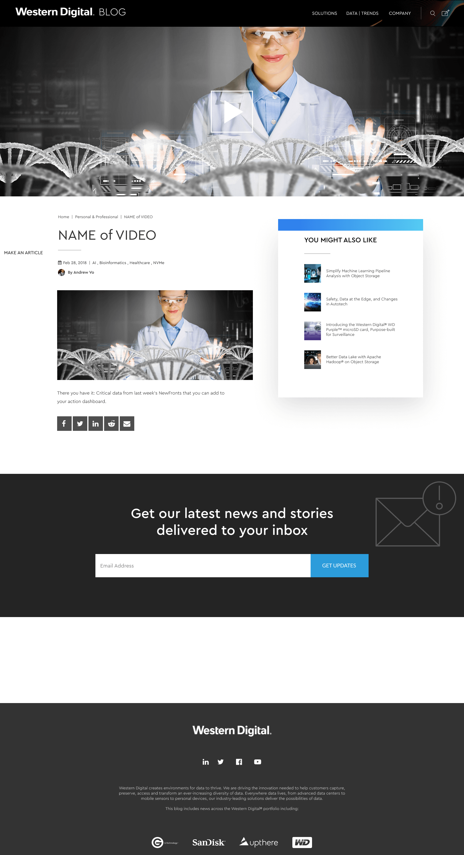
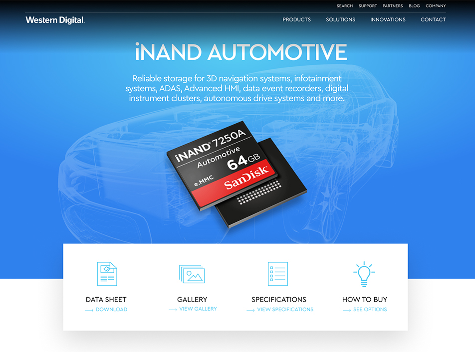
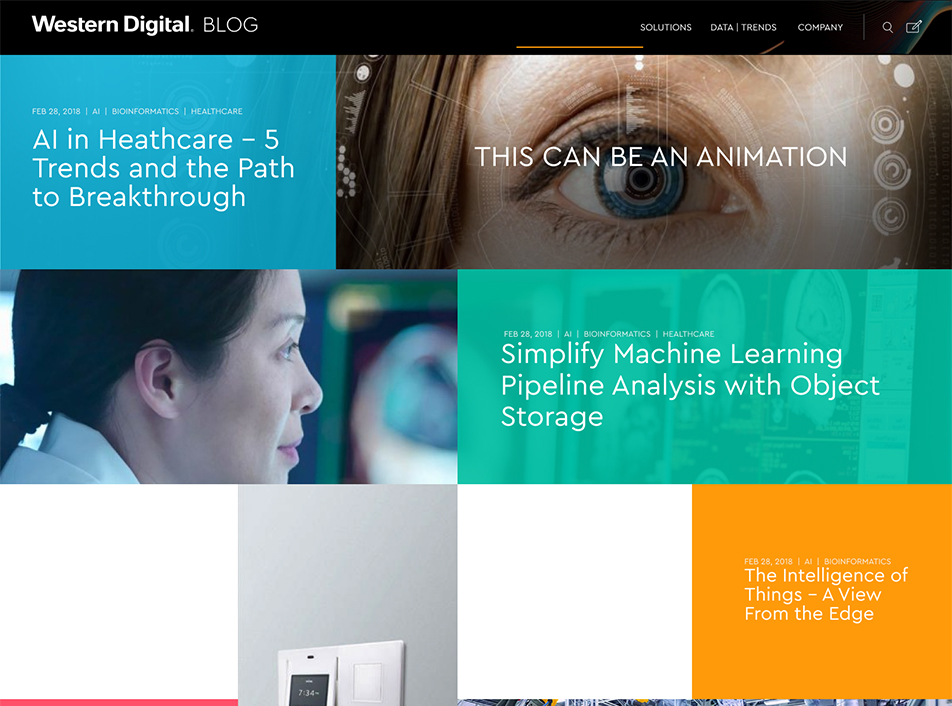
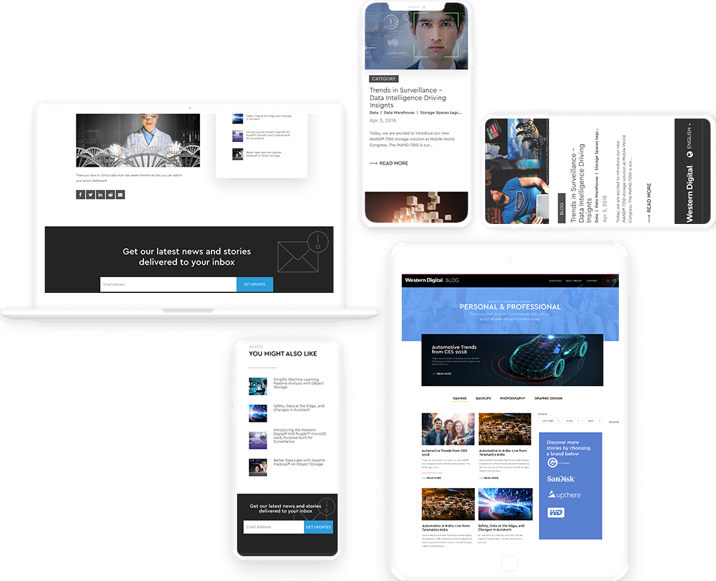
Designed an enterprise blog site that includes news across the Western Digital® portfolio, including WD, SanDisk, G-Technology, and Upthere. Our design hierarchy focused on the strengths of all these companies through the use of scannability principles and progressive disclosure, while giving an in-depth analysis of its breadth of products.

Date

August 2018 - November 2018

Role: Design Lead

  • Ideation
  • System Design
  • Design Led Research
  • Interaction Design
  • Prototyping
  • Usability Testing

Project Summary

Western Digital is a leading data infrastructure company that provides hard-disk drives (HDDs), solid-state drives (SSDs), fabrics, and storage platforms. In the competitive HDD market, the company's R&D team constantly seeks to innovate and educate its customers on the companies goals, innovations, and team members. The purpose of our project is to create a corporate blog that drives with the best information to Western Digital partners and consumers.

Experience a world of possibilities with data storage at Western Digital

Project Objective

The objective was to retain the brand consistency using one design system and integrate the new portfolios to it, thereby enhancing and creating a universal corporate blog while stamping Western Digital’s identity.

Defining Requirements

Western Digital offered some requirements for the website; while the research process revealed others:

  • Mobile-First strategy design
  • Combine brand companies portfolio into one corporate blog experience
  • Move to SAP Hybris + Adobe Experience Manager
  • The website supports 60-70% of its customers 
  • The website captures all competitive advantages of its portfolio brands
  • The website accesses and transforms an ever-increasing diversity of information in data

Pages Designed

  • Landing Desktop page
  • Landing mobile page
  • Blog Details Desktop page
  • Blog Details mobile page
  • Persona Desktop page

  • Persona mobile page
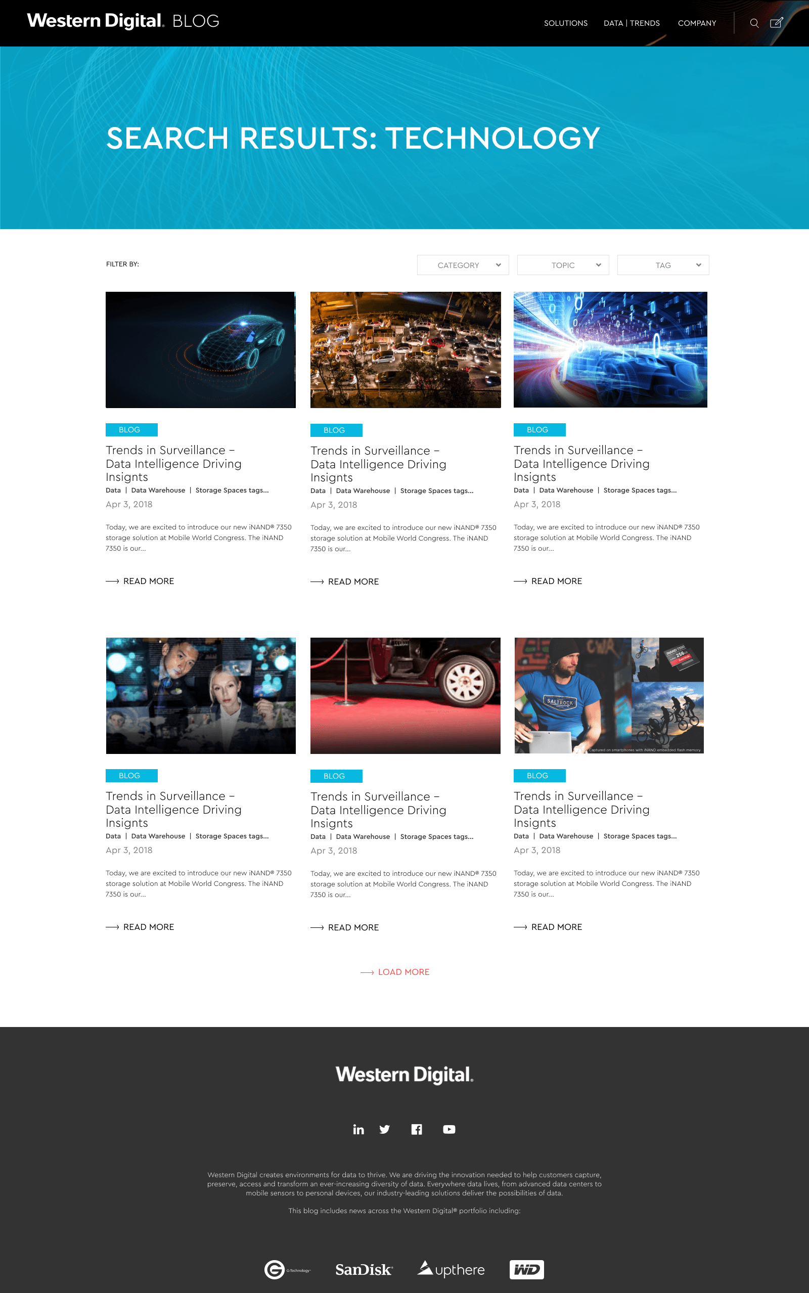
  • Tag Search Desktop page
  • Tag Search mobile page
  • Video Desktop Page
  • Video mobile Page

Choosing the font

Choosing the right fonts when dealing with 3 different brands that have their own visual and design system proved to be the most important part of building the site. Though fonts are a small part of the tye website, they make huge impacts on your website. We spent more time picking the right font design to help gain a deep psychological impact on our target customers who visit the site.

A B C D E F G H I J K L M N O P Q R S T U V W X Y Z

a b c d e f g h i j k l m n o p q r s t u v w x y z

Cera Pro

Cera is a steadfast companion for when you need to set clean text and headlines in print and on-screen and in multiple languages. It driven by pure geometry and our decision to finally use Cera pro was based on its uniformity style that can merge all three companies style guide.

Low Fidelity Site Design

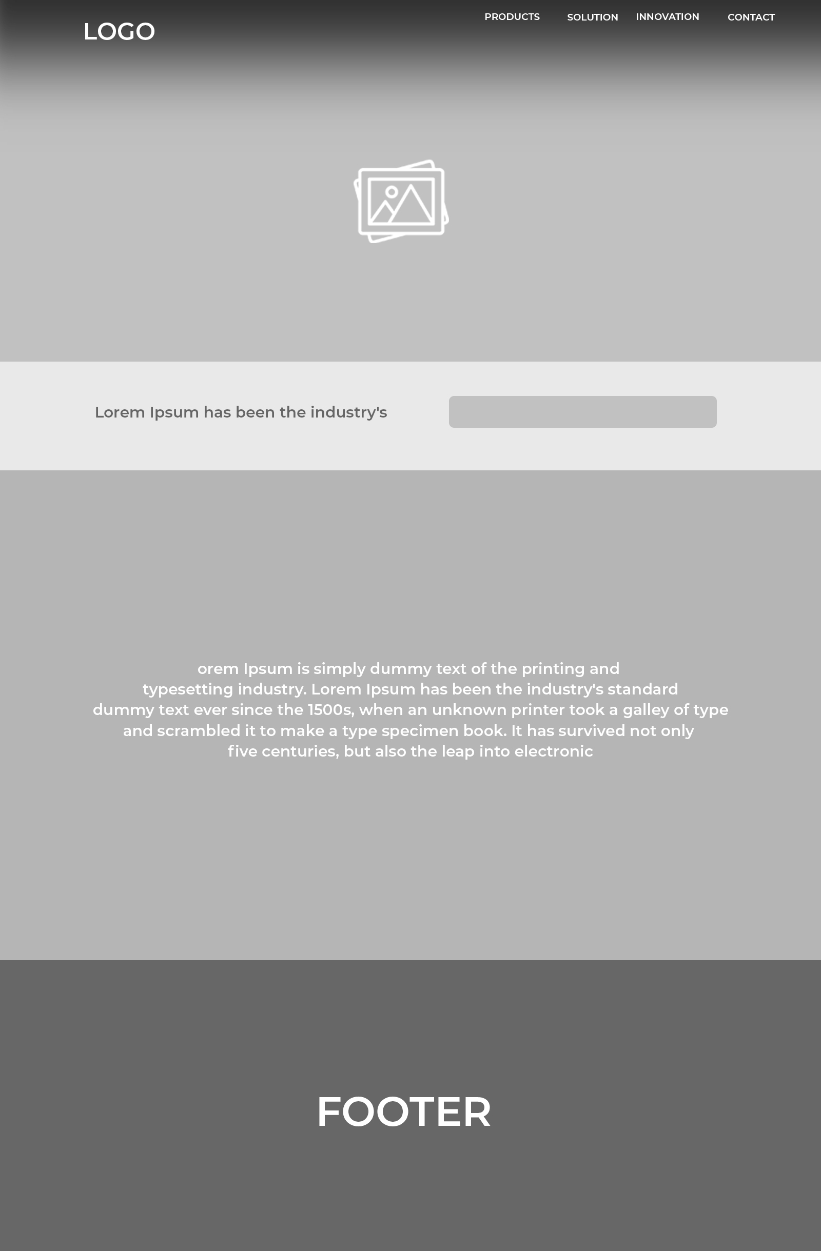
Once the website’s requirements were clear with several interviews with stakeholders and product managers, I created low fidelity designs intending to focus on the most essential features. After weeks of feedback loop with stakeholders, I then conducted a usability testing using low fidelity designs to gain insights and co-create with our target market the logic of my design and test its navigation features.

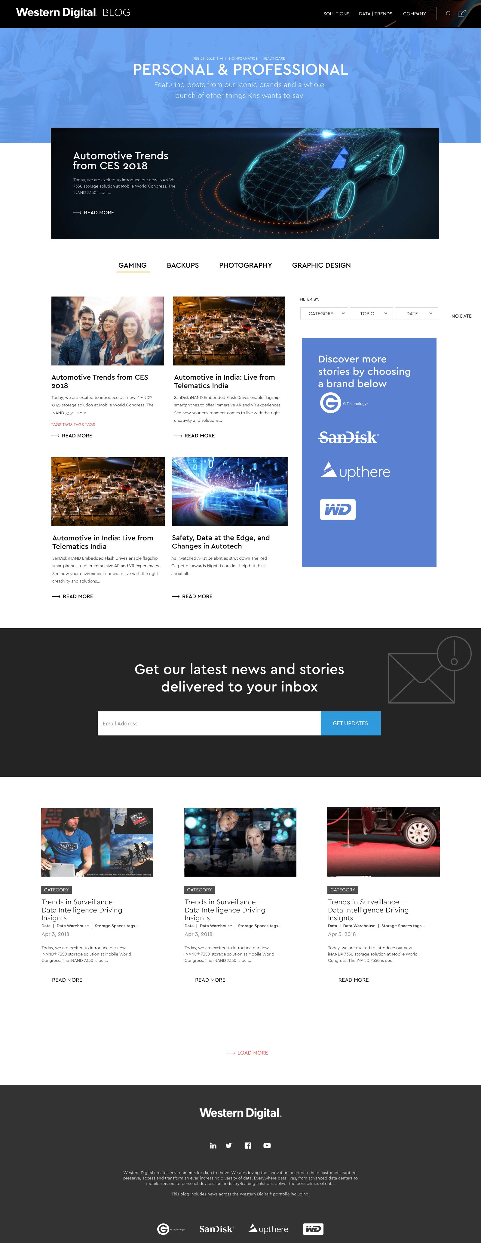
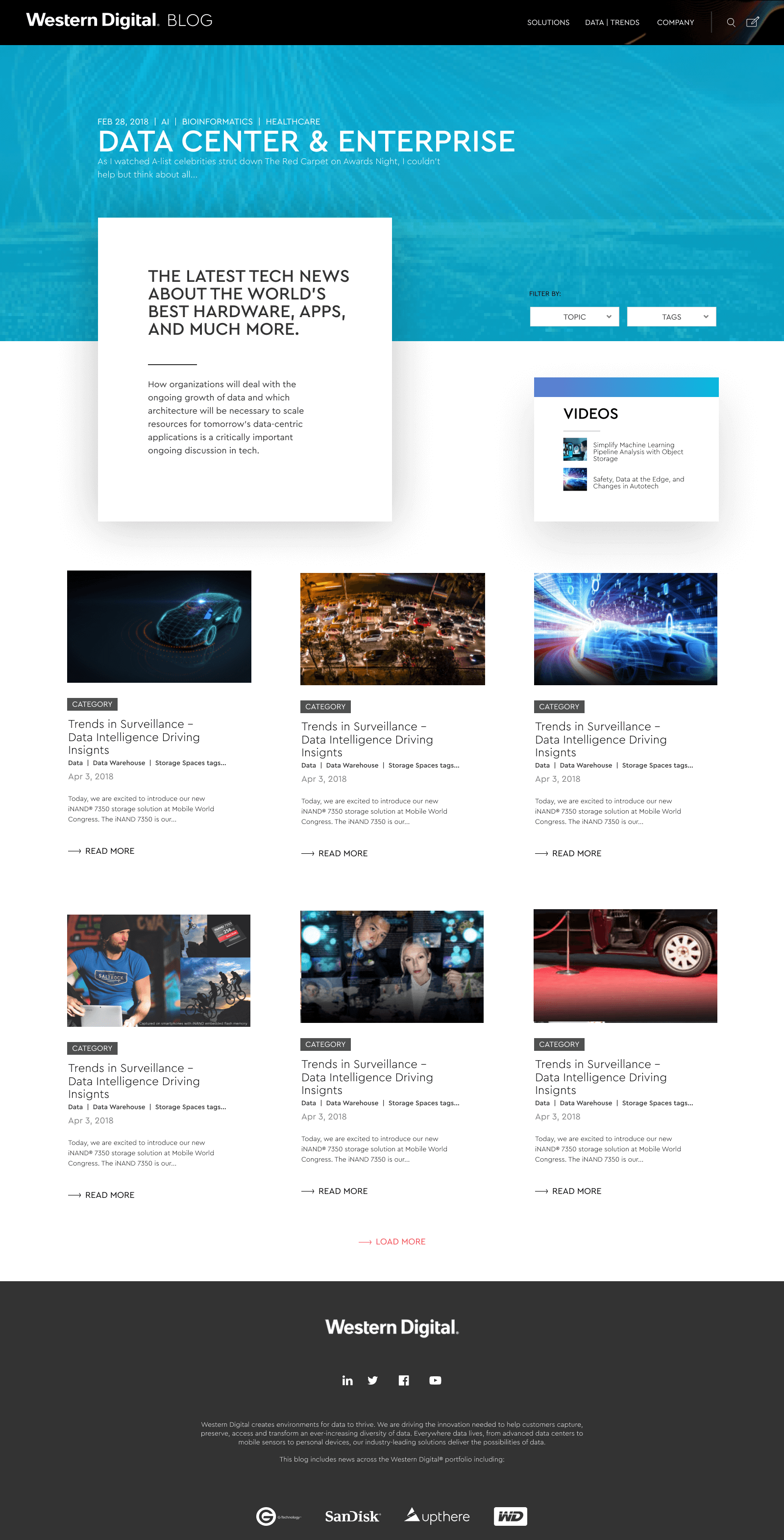
High Fidelity Page Designs

Visual Design

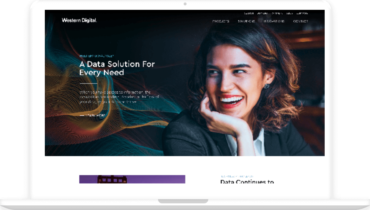
The blog’s visual presentation was designed to encourage readers to continue from one article to the next. Attention-grabbing pieces of content and story leads took front and center. Each article transitioned smoothly into the next. Although blog posts largely consist of large blocks of text, these blocks were carefully carved into smaller, more easily-digested pieces for readability. The blog also consisted largely of images showcasing brand-name products.

image
image
image

Conclusion

Western Digital Corporate goal was to create a hub that creates environments for data to thrive for its portfolio brand and its consumer base. This will help people capture, preserve, and get access to pieces of information within the Data storage industry. Our design intervention increased its subscription by 32% across the Western Digital® portfolio, including WD, SanDisk, G-Technology, and Upthere. Through co-creation with developers and stakeholders, we were able to deliver outstanding speed, performance, and reliability that improved engagement by 41%.