


Overview
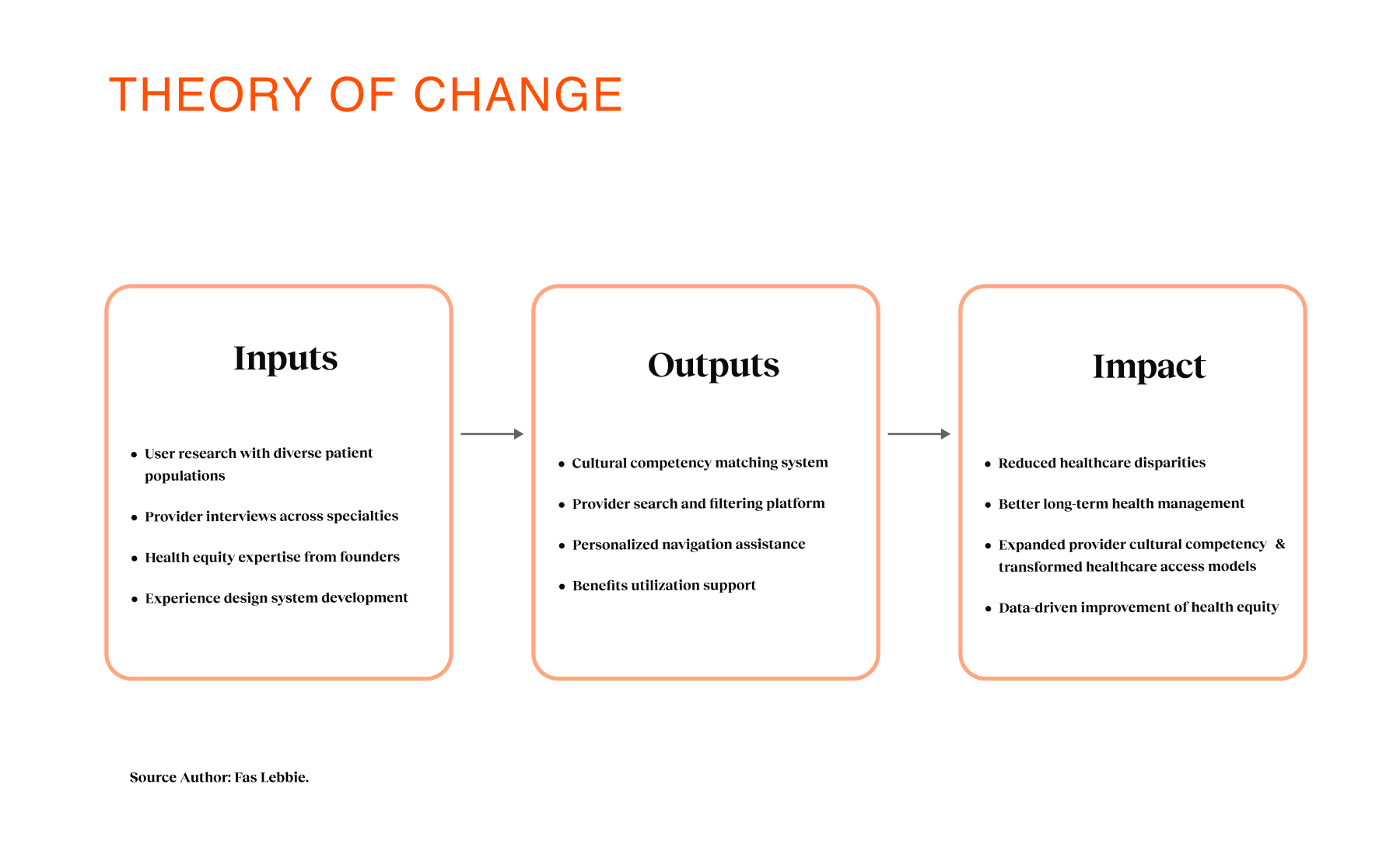
Early cancer detection saves lives, but for Black and Latinx communities, the pathways to care are often broken. The systems intended to help are frequently fragmented, culturally disconnected, or simply inaccessible due to deep-seated medical mistrust and operational complexity. Many employees in these demographics delay care not because they lack awareness, but because the system wasn’t designed with their lived experiences or time constraints in mind. Coral Health addresses this by reimagining the screening experience as a guided, culturally competent journey rather than a series of disjointed medical tasks. We partnered with employers to offer a platform that connects users to personalized assessments, home-based testing modalities, and providers who actually understand their background. As the sole founding product designer and strategist, I worked alongside the founding clinical team to architect the entire ecosystem—from the assessment logic and testing flows to the results interpretation and longitudinal task management. Our goal wasn’t just to ship an app; it was to build a predictable, modular system that targeted early drop-off rates, increased trust, and made life-saving screenings achievable for the communities that need them most.
Research & Design
Mixed-Methods User Research · Platform Design (UX) · Branding · Cultural Competency Frameworks · Platform Architecture · Journey Mapping · Screening Workflow Modeling · Assessment Design
- Duration: March 2022–February 2023
- Team: Team: Fas Lebbie (Design + Strategy), Patrick Wesonga (Product), Dr. Fatima Cody Stanford (Clinical Lead), Dr. Chris T. Pernell (Clinical & Equity Lead)

WHAT I BROUGHT
I established a Design KPI Framework that shifted the organization’s focus from vanity metrics to preventative health outcomes. By defining how UX signals (like clarity and task success) laddered up to clinical success and employer ROI, I aligned engineering and clinical operations around a shared vision of "trust as a metric".
I led a mixed-methods research program targeting Black, Latinx, and immigrant populations to uncover the specific friction points driving screening avoidance. I synthesized these signals to reframe the opportunity: we weren't just solving for access, but for psychological safety and "Time to Relevant Match".
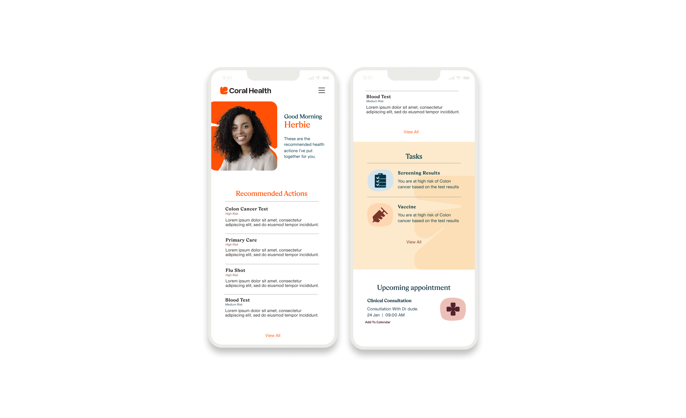
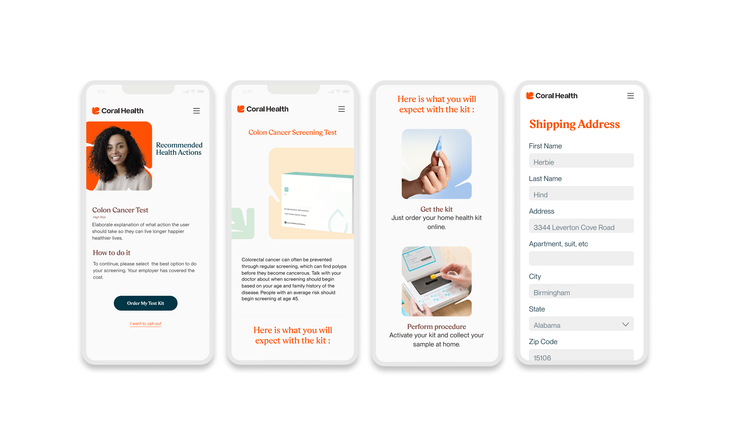
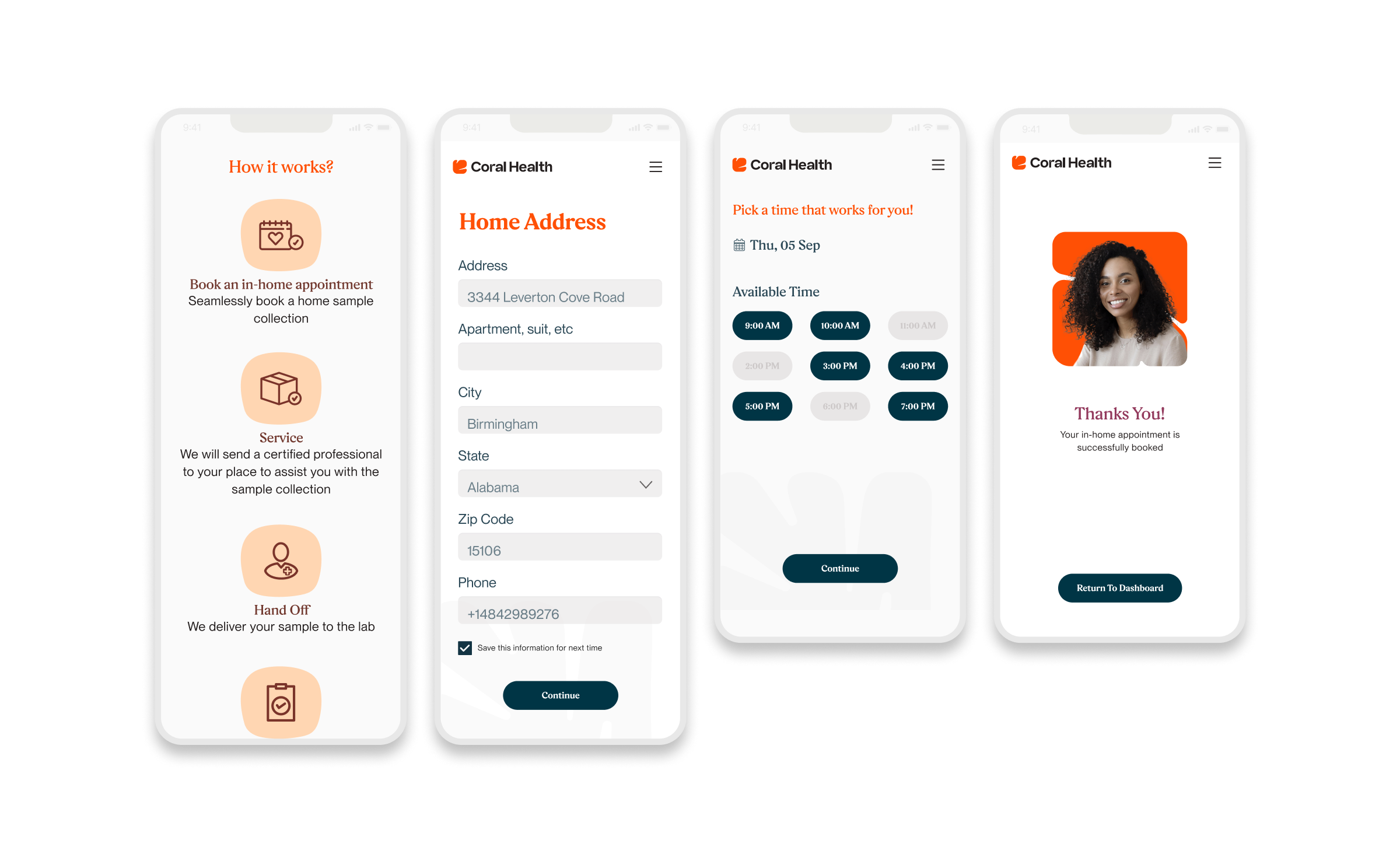
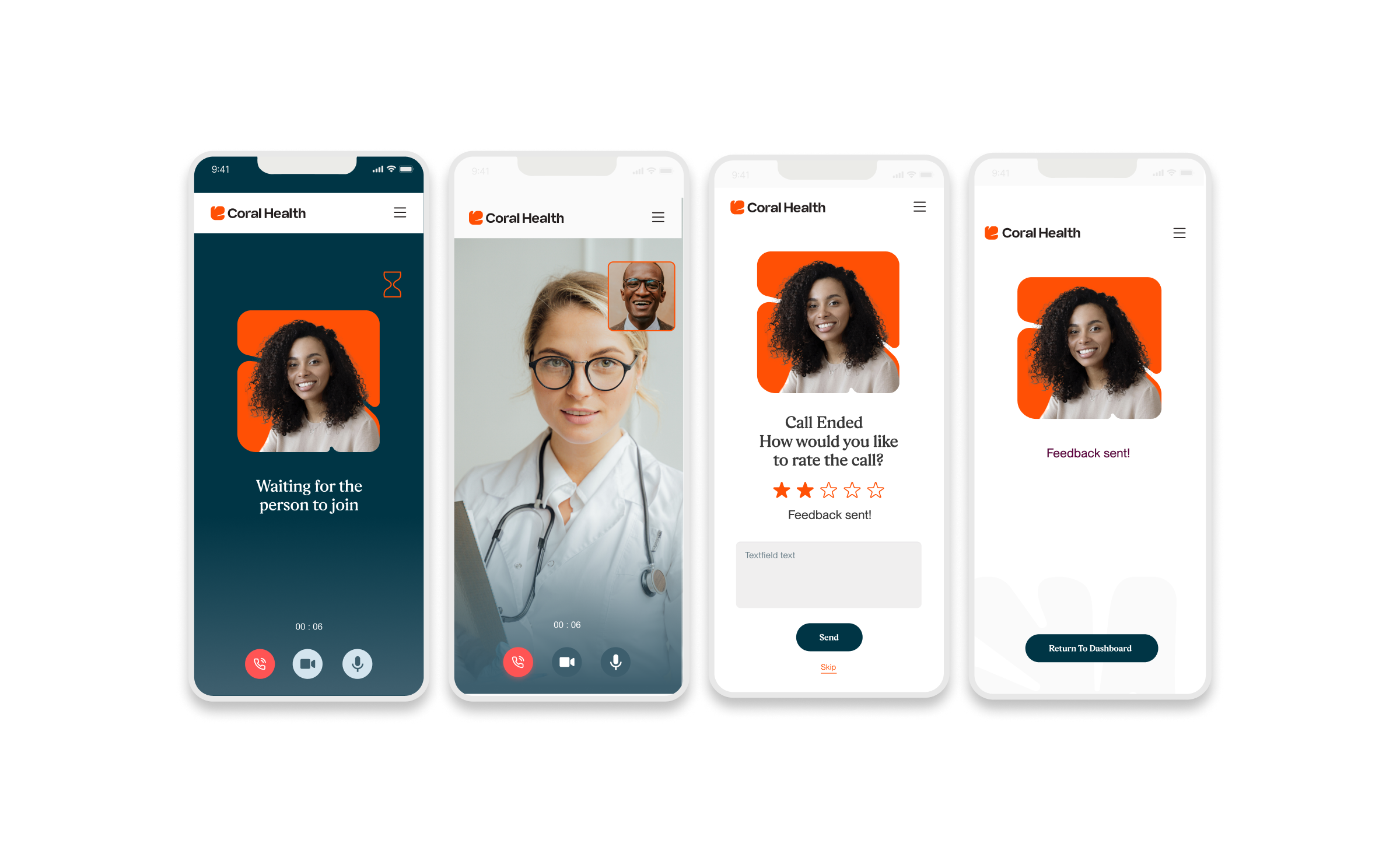
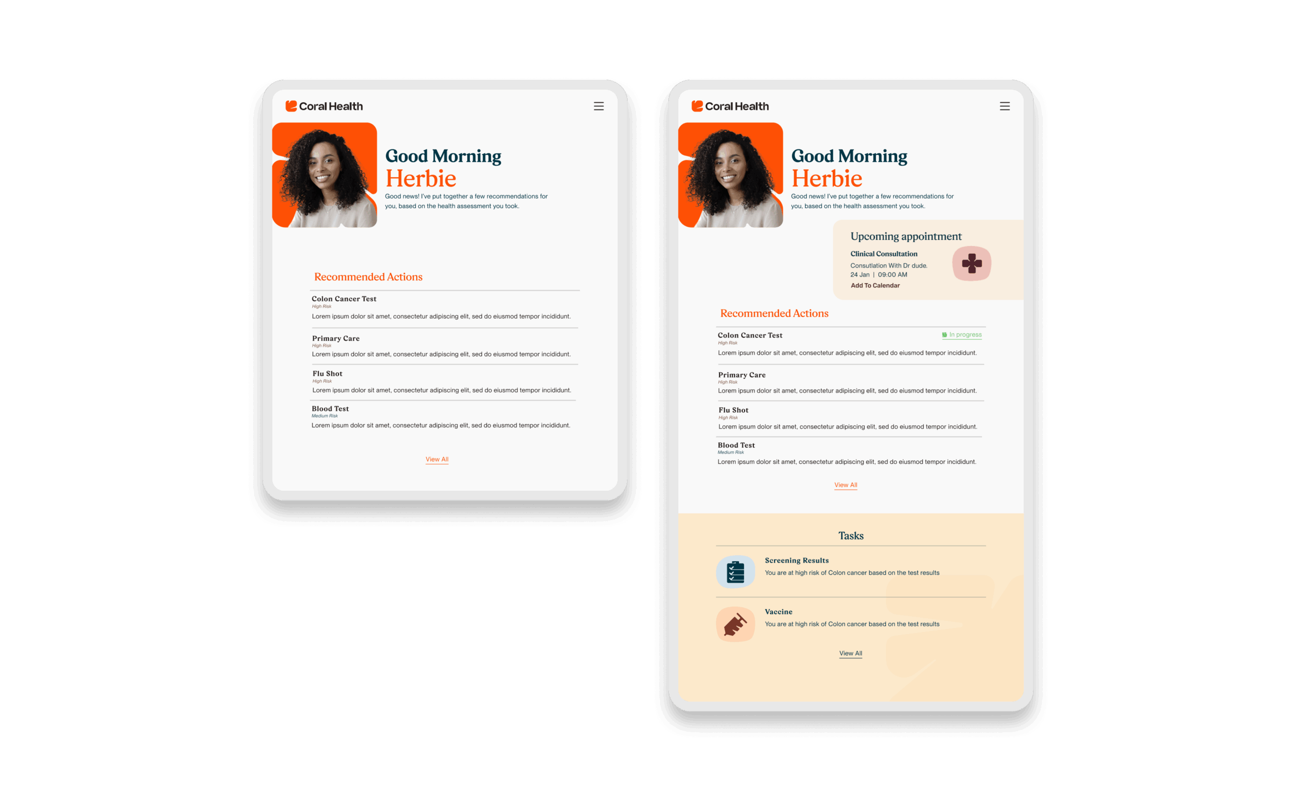
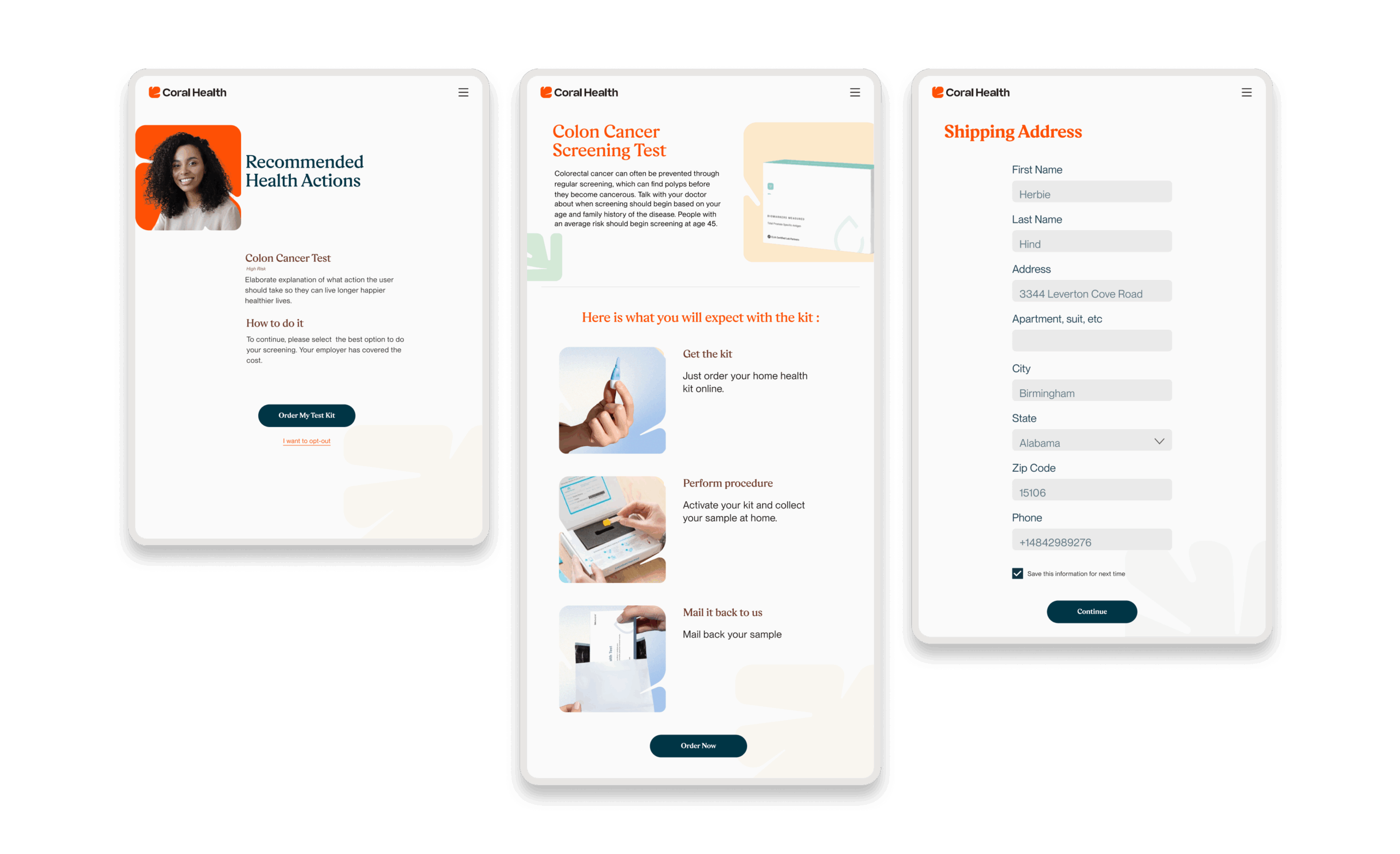
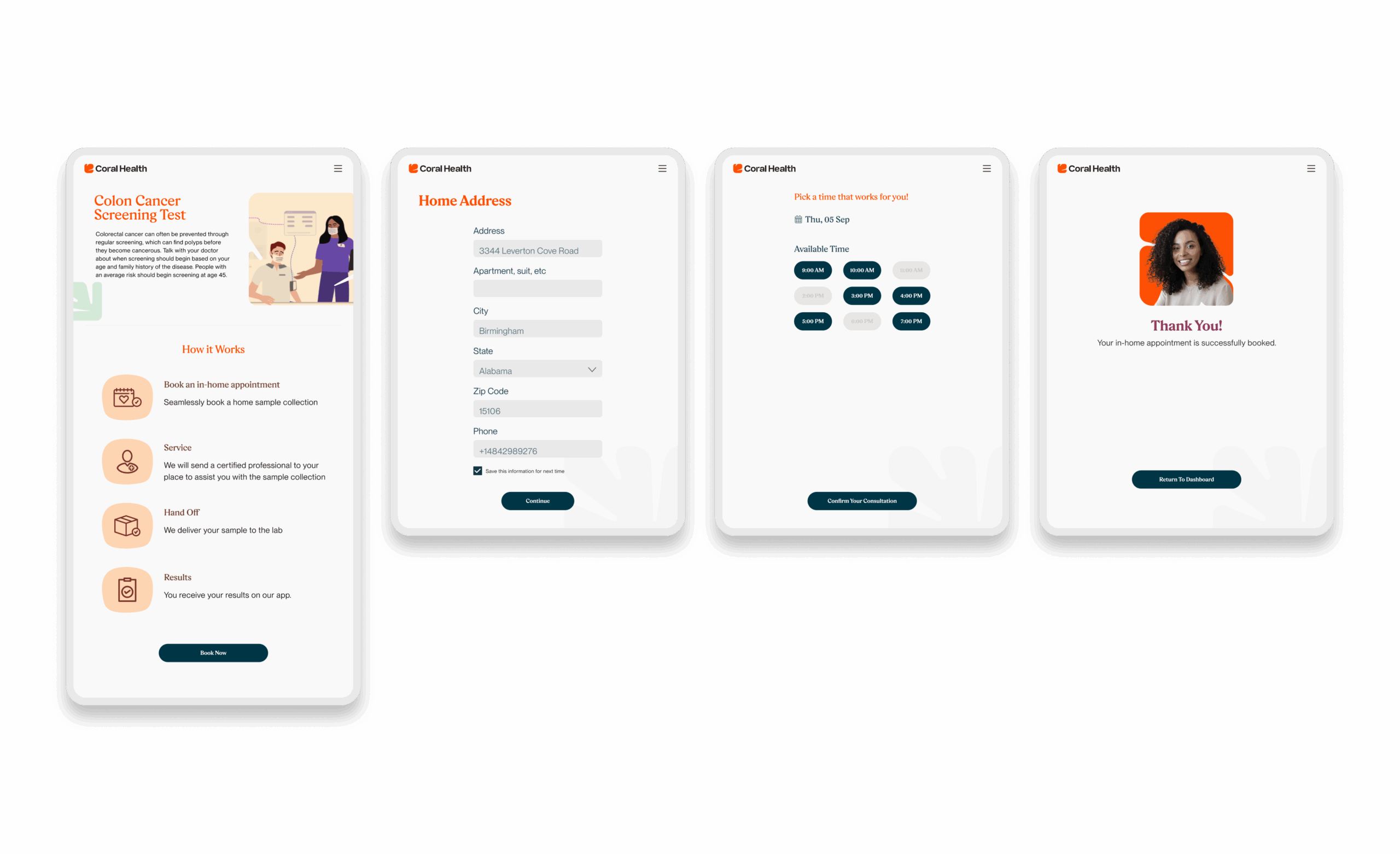
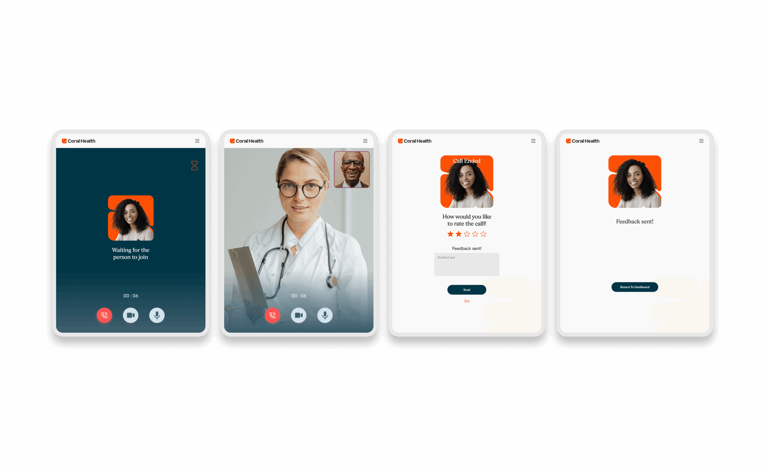
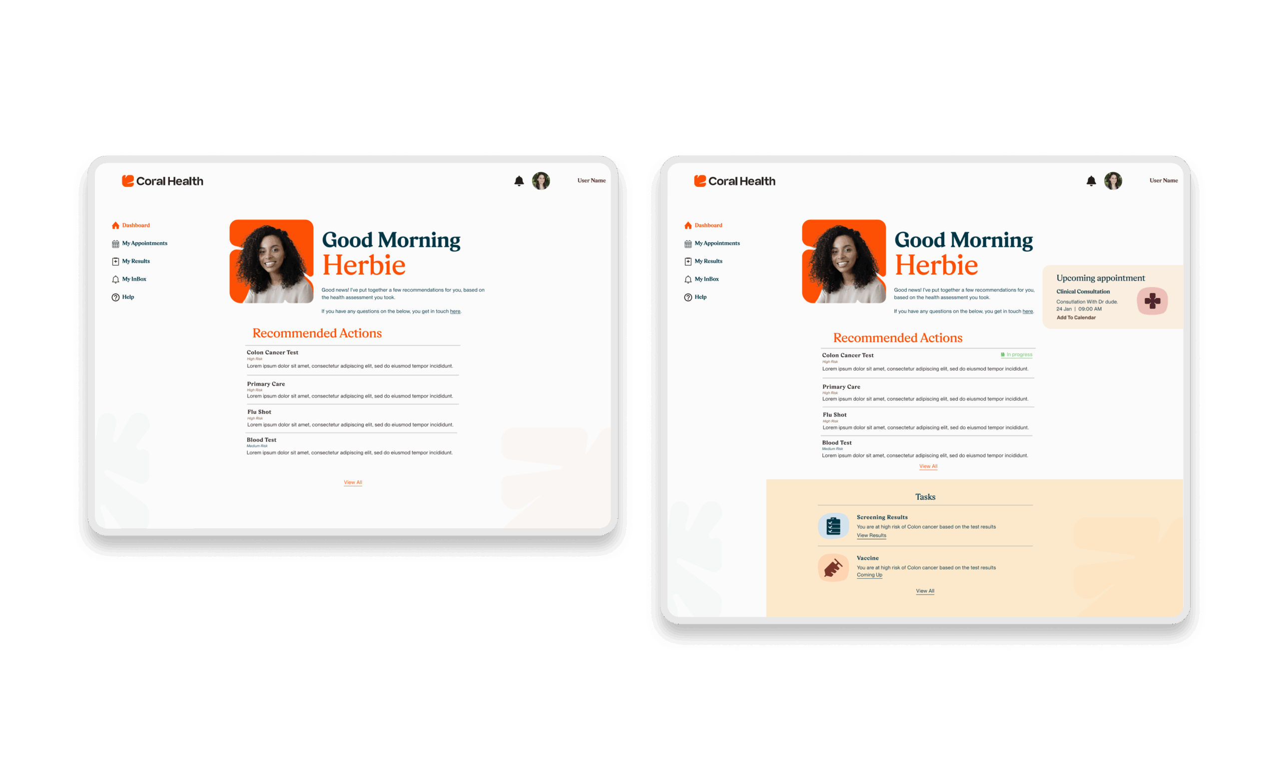
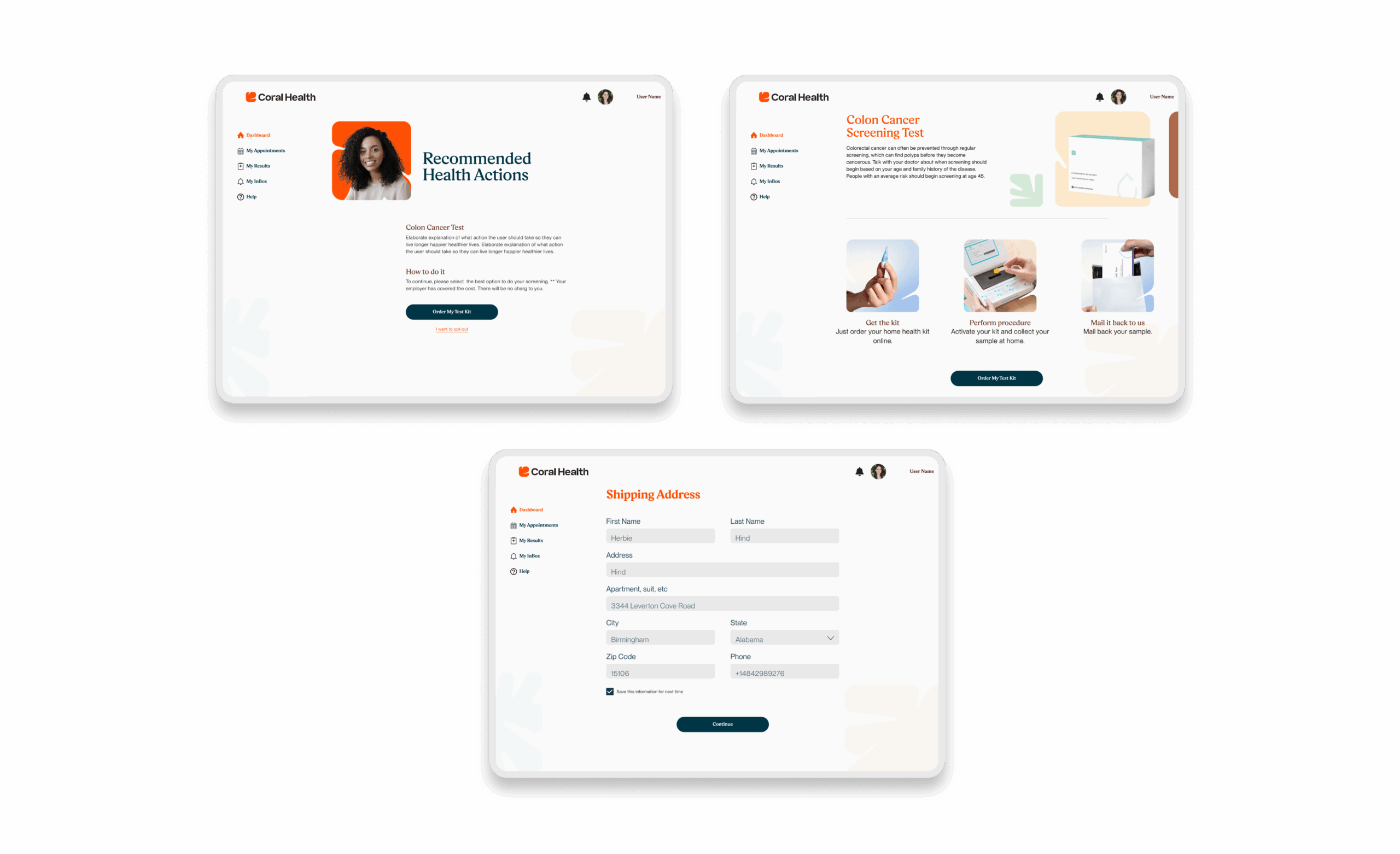
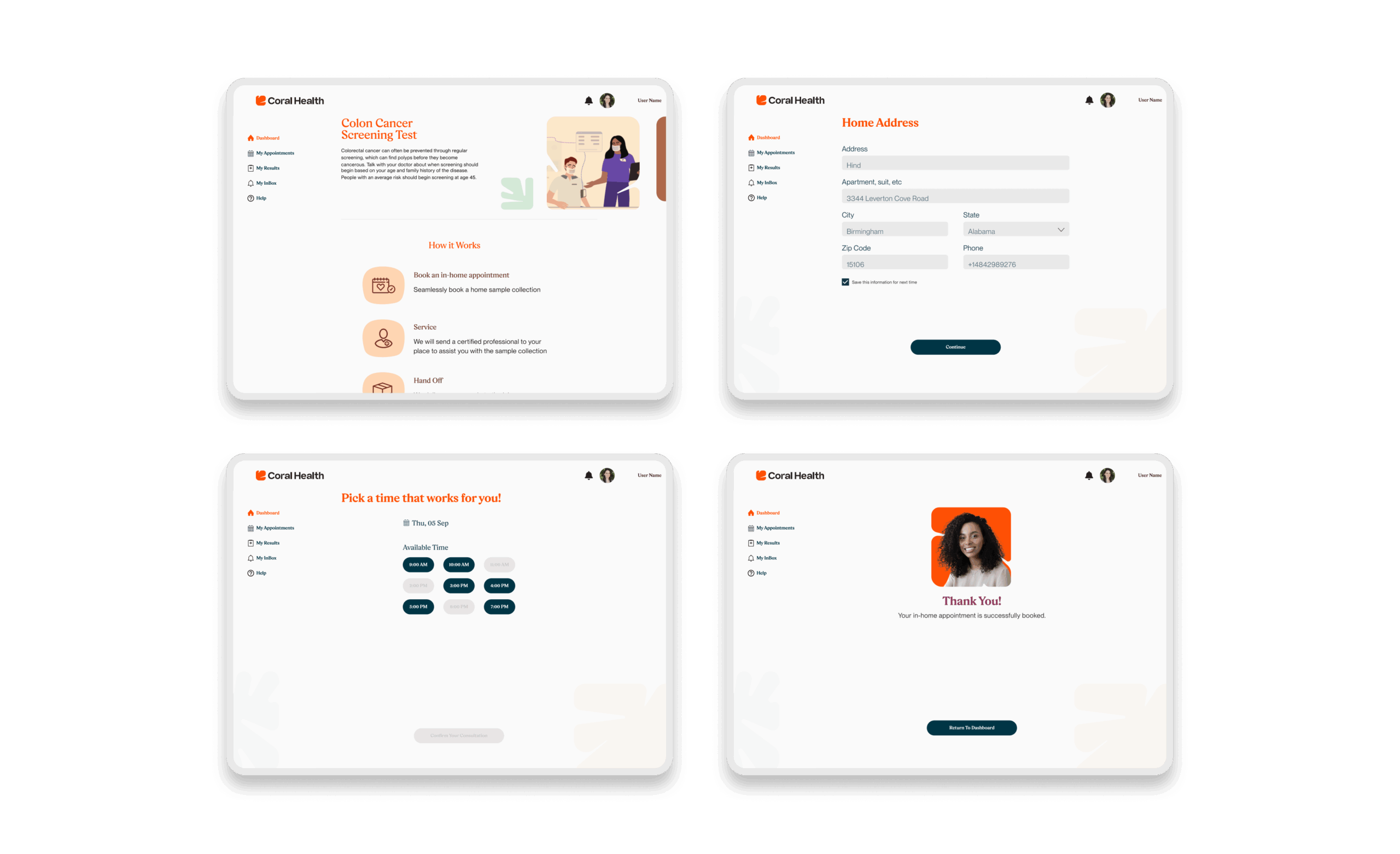
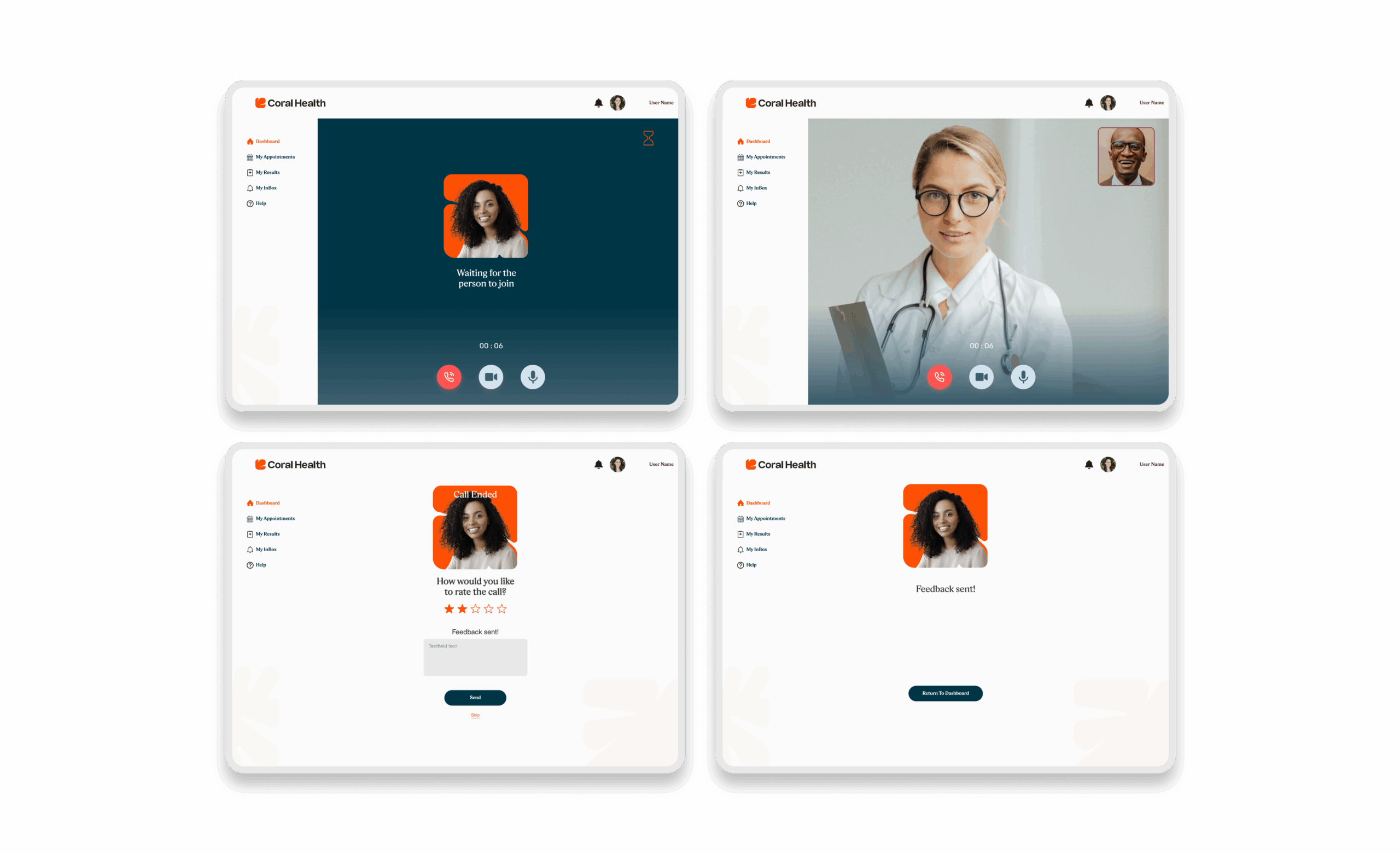
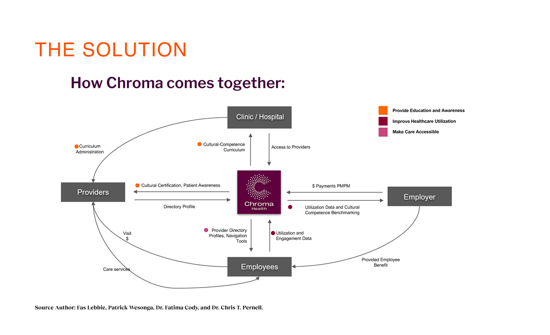
I architected the end-to-end modular system, moving beyond linear flows to a "lane choice" model based on risk. This included designing the logic for assessments, home-kit logistics, and video consultation usage to ensure a cohesive, non-fragmented journey.
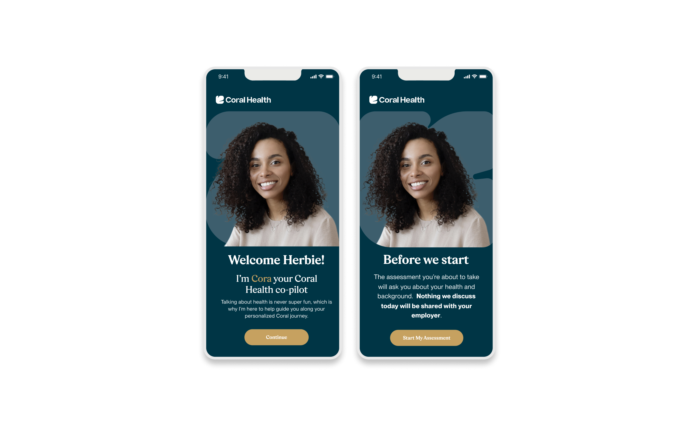
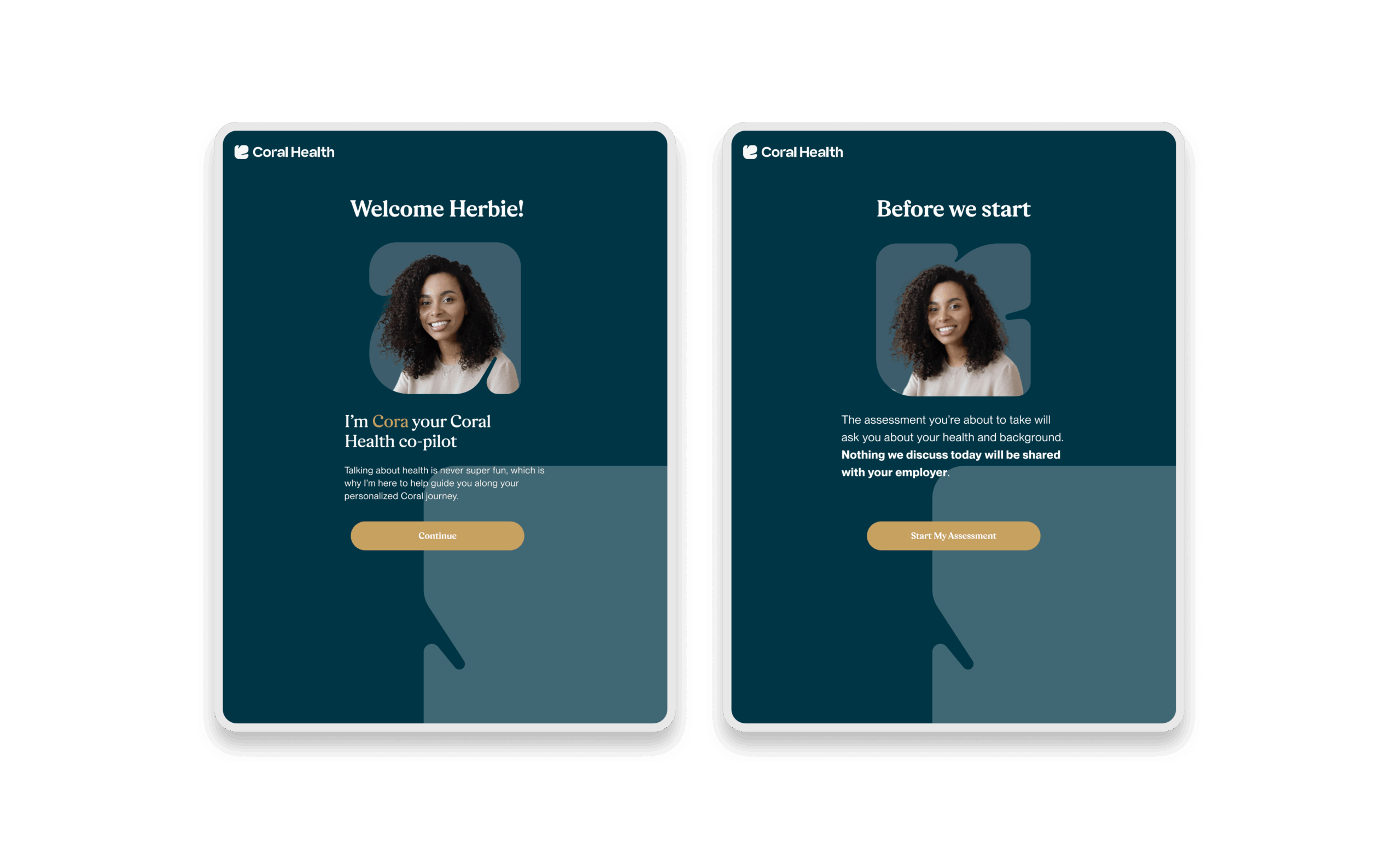
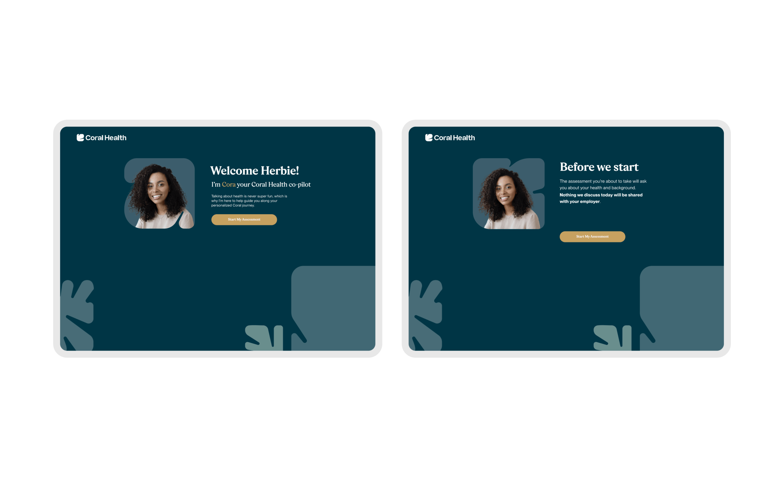
Working directly with clinical leads and engineers, I translated complex medical guidelines into an operational design strategy. This collaboration ensured that our digital interventions, such as the "Cora" chatbot guide, were clinically accurate while reducing users' cognitive load.
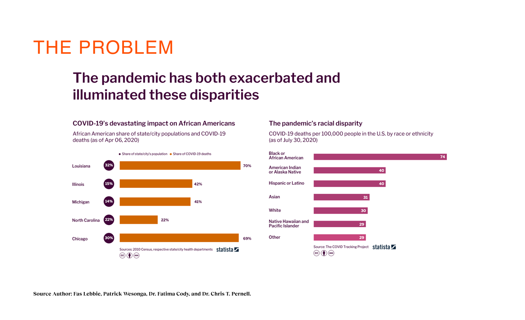
Problem Context
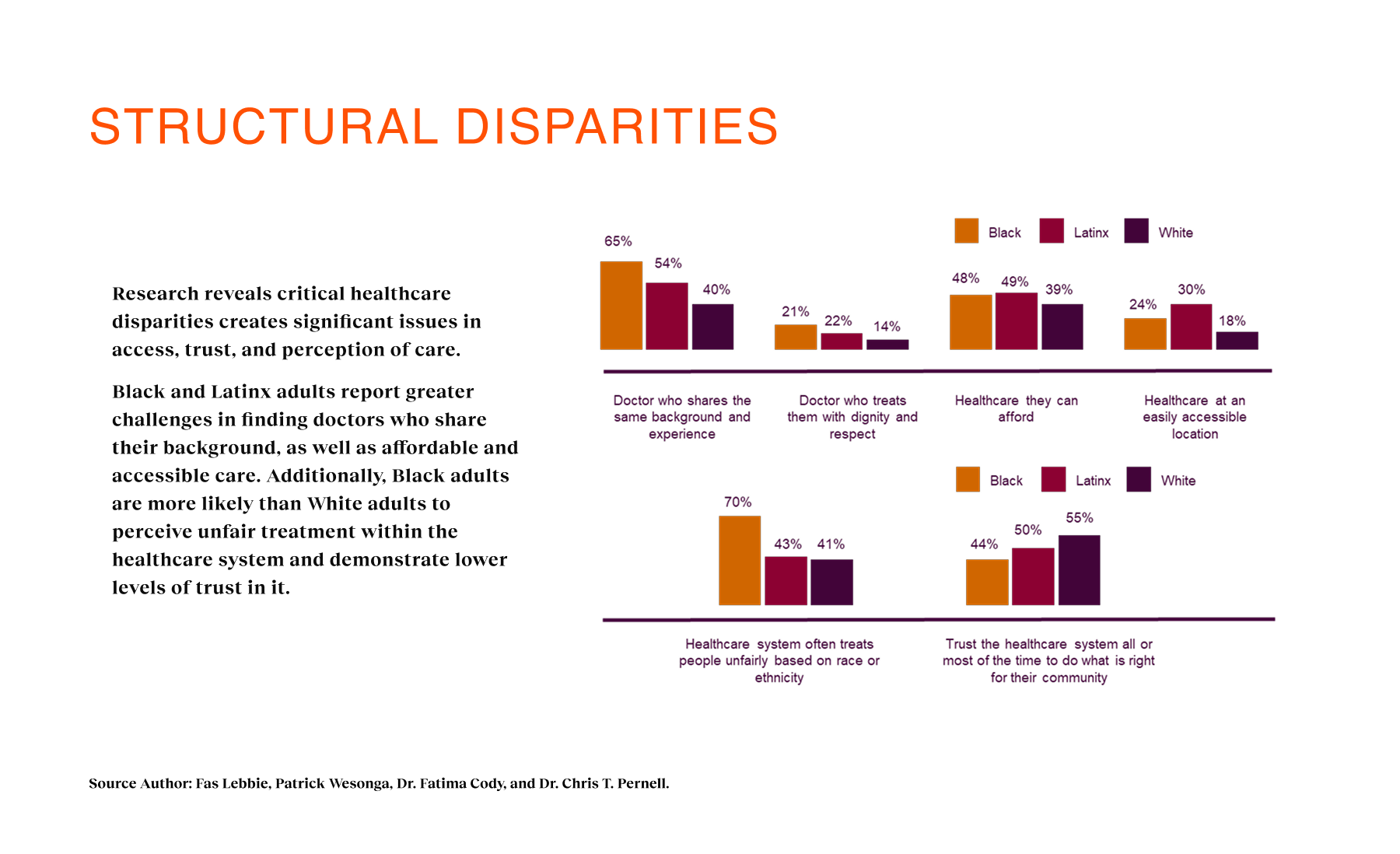
In the U.S., 83% of health outcomes show worse results for Black patients compared to White patients, and Black women face 3× higher pregnancy-related mortality. Yet, the system often treats these disparities as inevitable. We found that 65% of Black adults and 54% of Latinx adults struggle to find providers who understand their cultural backgrounds. This creates a cycle of mistrust: patients delay care, avoid screenings, and disengage until it is too late. The existing landscape offered them fragmented directories and cold clinical portals, forcing them to act as their own case managers in a system that didn’t seem to see them. For Coral Health, the challenge wasn’t just technical; it was systemic and economic. We had to intervene upstream. Traditional primary care dependency was a major barrier because many employees of color didn’t see PCPs regularly or faced “surprise costs” that eroded trust. We needed a design intervention that could bypass these systemic failures, offering a direct, transparent, and efficient pathway to early detection.
My Approach
I applied a user-centered, culturally sensitive design process, starting with in-depth interviews across patients and providers to surface lived experiences of inequity. Through iterative prototyping and continuous feedback loops, the design directly addressed both cultural gaps (trust, representation, empathy) and practical barriers (insurance navigation, appointment access).
Design Process
Before we drew a single screen, the baseline picture was chaotic. Our initial investigation revealed that patients were navigating a “fragmented and exhausting search process,” bouncing between insurance directories, reviews, and outdated websites just to find a doctor they might trust. The “Time to Top Candidate” was days, sometimes weeks. The friction was palpable. Despite 77% of participants saying they were somewhat satisfied with their current providers, deep dives revealed that many felt unheard, rushed, or culturally misunderstood. They relied heavily on visual cues—photos and community recommendations—to assess safety, but the existing tools gave them almost no signal to work with. Additionally, the data showed that low trust was delaying preventive care. People weren’t avoiding health; they were avoiding the system. We realized our starting line wasn’t zero; it was negative, defined by a deficit of trust and an abundance of cognitive overhead.
.
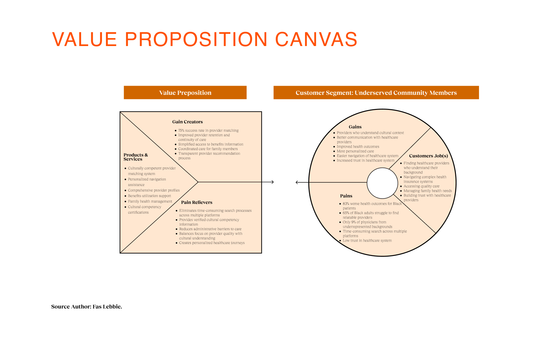
To understand the nuance of this mistrust, I led a triangulated research involving patient interviews across Black, Latinx, and immigrant backgrounds, alongside provider interviews with MDs and care navigators. We asked about their lives and their fears regarding the healthcare system. We used frameworks such as the Theory of Change to map how specific design interventions—such as cultural matching—could, in theory, lead to earlier detection. We also utilized Value Proposition Canvas mapping to align patient pains (fear of judgment, cost confusion) with our proposed solutions. The insights forced us to pivot our strategy. We initially thought the problem was access to appointments. But the research revealed that trust is non-linear and deeply tied to representation. Users needed to “see themselves” in the experience before engaging. We also learned that families make collective care decisions in these communities, suggesting our platform needed to support more than just the individual employee. This shaped a strategy focused on “Cultural Safety,” prioritizing transparency and representation over speed. We decided to strip away the clinical jargon and build a “modular lane” system in which the assessment determines the journey, reducing decision fatigue.
Through our research, several critical themes emerged that directly informed the product architecture and our metrics strategy:
- Cultural competence is a core trust signal. Patients repeatedly told us they scanned for cultural alignment before clinical credentials. They needed to know a provider “got it.” Meaning: We couldn’t just list doctors; we had to surface cultural competence credentials and deeper profile data. Implication: We designed “Smart Matching” algorithms to reduce “Time to Relevant Match,” prioritizing cultural and communication preferences over zip codes.
- The search process is exhausting. Users were switching between 5–7 sources to validate a single doctor. This cognitive load was a primary cause of early drop-off. Meaning: The platform had to be a “single source of truth” that integrated benefits, booking, and profiles. Implication: We centralized the ecosystem, removing the need to leave the app to check insurance eligibility or read reviews.
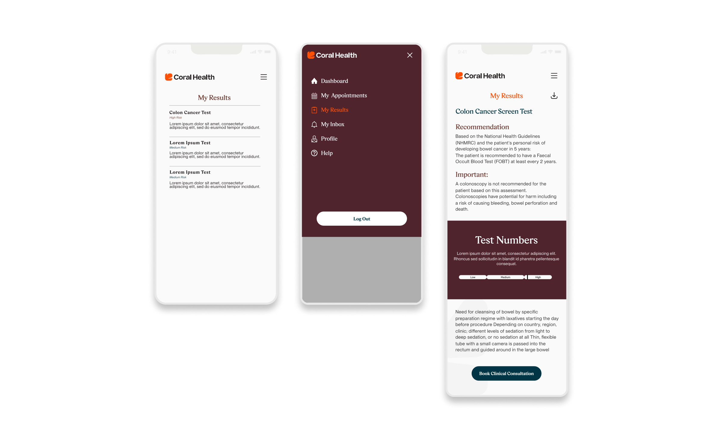
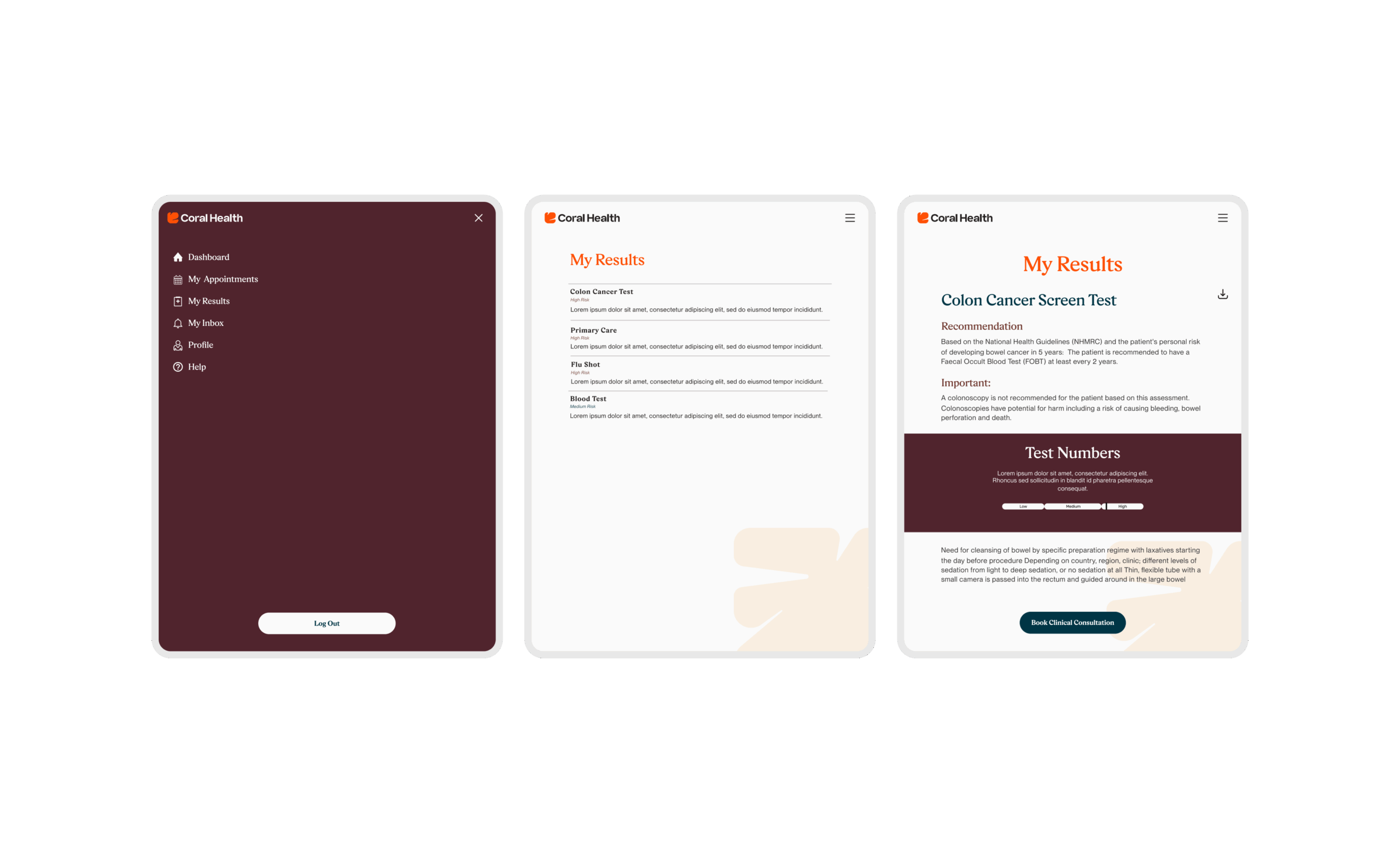
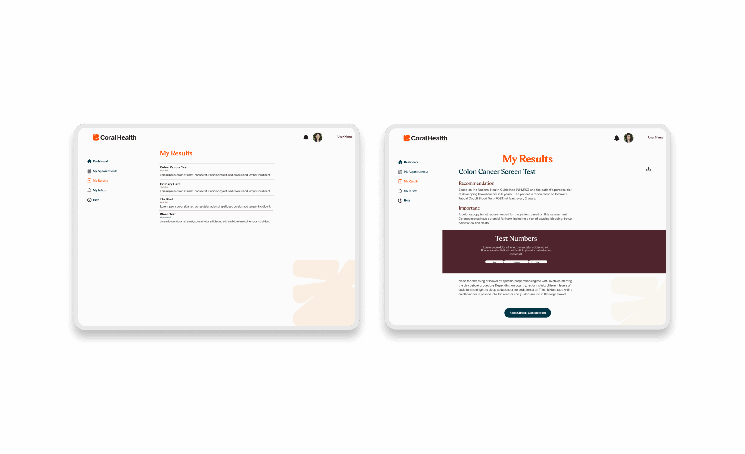
- Transparency reduces anxiety. Fear of the unknown, especially regarding test results and costs, paralyzed users. Meaning: Ambiguity is a barrier to care. Implication: We designed “Plain Language” results screens and transparent pricing banners to eliminate the fear of “surprise billing” that disproportionately affects underserved groups.
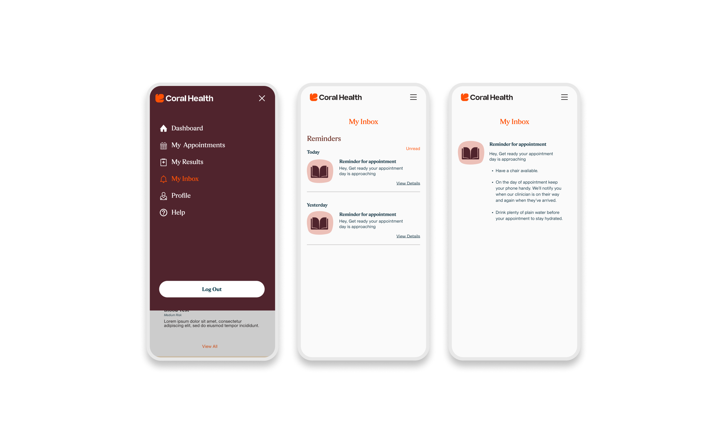
- Practical barriers are as lethal as cultural ones. Even with trust, logistical issues like transportation and childcare disrupted screenings. Meaning: Convenience is an equity issue. Implication: We prioritized at-home test kits and in-home phlebotomy options to meet users where they physically are.
We knew that for Coral Health to succeed, we couldn’t just measure “clicks.” We needed a framework that connected the user’s emotional reality (trust, anxiety) to the business’s bottom line (retention, cost savings). Before beginning design, I worked with stakeholders to establish UX KPIs and impact goals to ensure the experience design would ladder up to a health outcome.
- Goal 1: Improve UX Quality to Build Trust. In a high-stakes health journey, confusion looks like incompetence. Any friction in the UI would be interpreted as a lack of care. The Goal: We aimed to optimize for Content Clarity and Task Success Rate. By measuring and minimizing the “Error Rate” on kit-ordering flows, we intended to remove the micro-failures that cause users to abandon care.
- Goal 2: Accelerate Time-to-Value. Our baseline data showed users spending days fragmenting their search across different sites. The Goal: We set a target to reduce “Time to Relevant Match drastically.” The design needed to filter providers and present a “top candidate” faster than the user could do on their own, proving the platform’s worth in the first session.
- Goal 3: Drive Business Impact through Behavioral Change. Engagement means nothing if users don’t complete the screening. The Goal: We focused our downstream metrics on Screening Completion (Revenue) and Appointment Attendance (Cost Efficiency). If we solved the upstream UX quality issues (clarity, trust), these lagging business indicators would naturally improve.
We adopted a “design by accretion” approach, starting with low-fidelity prototypes to validate the core mechanics before adding the layer of visual trust. I began by mapping the modular flows, moving from assessment to “lane choice,” to ensure the logic held up across different risk profiles. In the early stages, we tested wireframes to see if users understood why they were being recommended a specific screening. We measured “Content Clarity” closely here. We quickly realized that without clear “why” messaging, users felt targeted rather than cared for. This feedback loop allowed us to refine the content strategy significantly before engineering began.
As we moved to high-fidelity, the focus shifted to emotional resonance. We prototyped the “Cora” assessment guide to test tone and approachability. We iterated heavily on the Results Interpretation screens, moving away from scary red text to supportive, clear data visualizations.
Implementation was phased. We launched with a “Foundation” phase focused on the match and dashboard, followed by the complex “Guided Screening” workflows involving test kit logistics. This phasing allowed us to validate the matching KPIs (NPS and Match Success) before incurring the operational costs of physical kits. We worked closely with clinical ops to ensure our digital flows aligned with the physical reality of lab processing.
.
Design Interventions
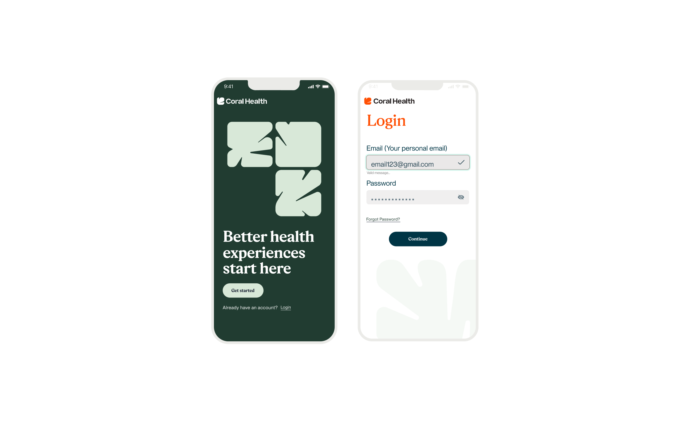
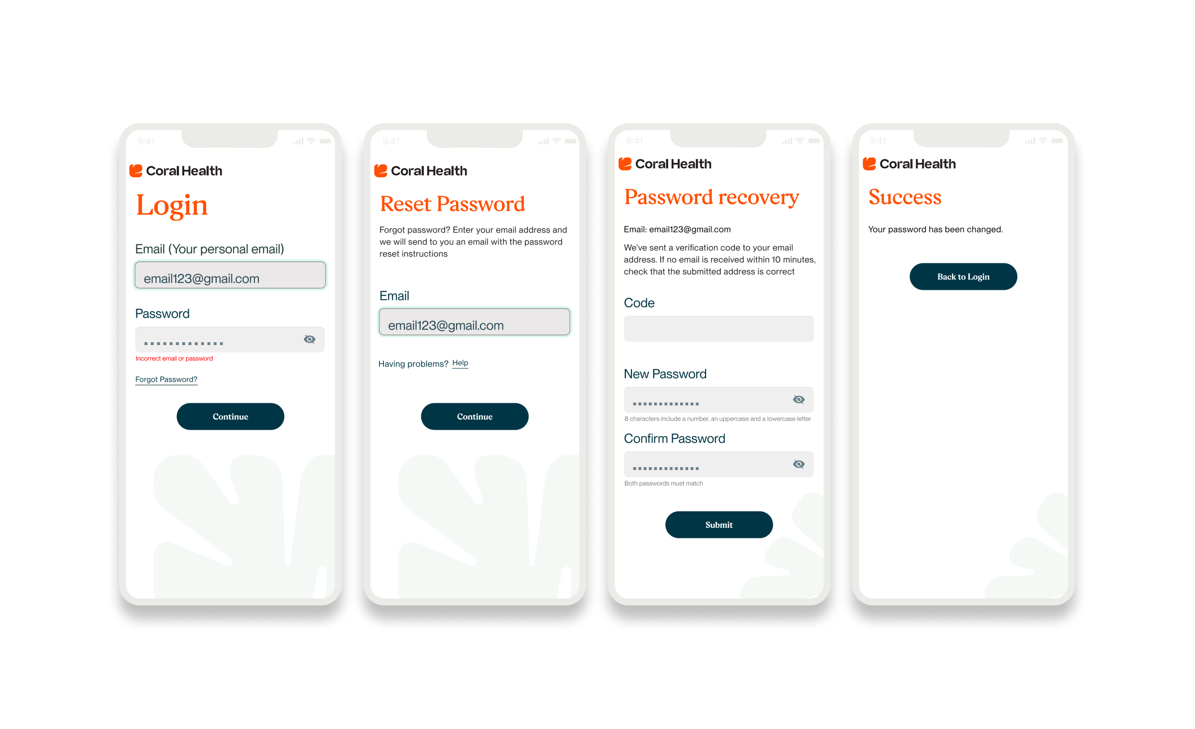
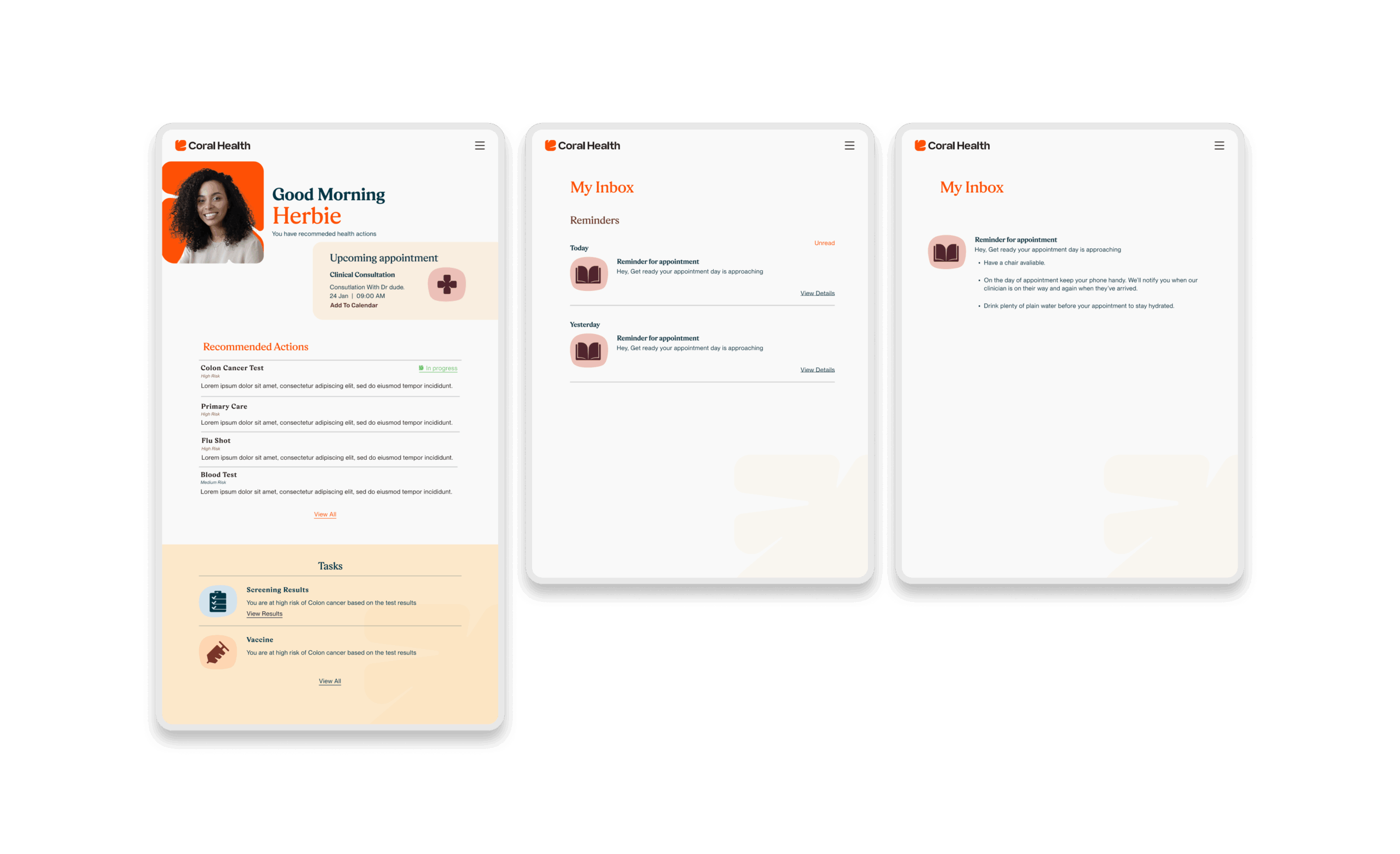
The core intervention was shifting the mental model from a "directory of doctors" to a "guided care pathway". We didn't just build a search bar; we built a modular system that takes a user by the hand. The platform uses a culturally competent assessment to triage users into specific "lanes" (screening, vaccination, or education) that directly impact "Time to Top Candidate/Action". This worked because it directly addressed the "fragmentation" finding. By integrating eligibility checks, kit ordering, and results interpretation into one flow, we removed the friction points where users typically drop off. The design used plain language and representations, specifically the "Cora" guide, to bridge the trust gap, turning a clinical transaction into a relational interaction. Effectiveness was measured by our UX KPIs: by reducing "Time to Decision" and cognitive load, we saw trust signals increase. The intervention succeeded because it acknowledged that for this population, the barrier wasn't just logistical, but also emotional. We designed for the anxiety, not just the appointment.
Core Experience Flows
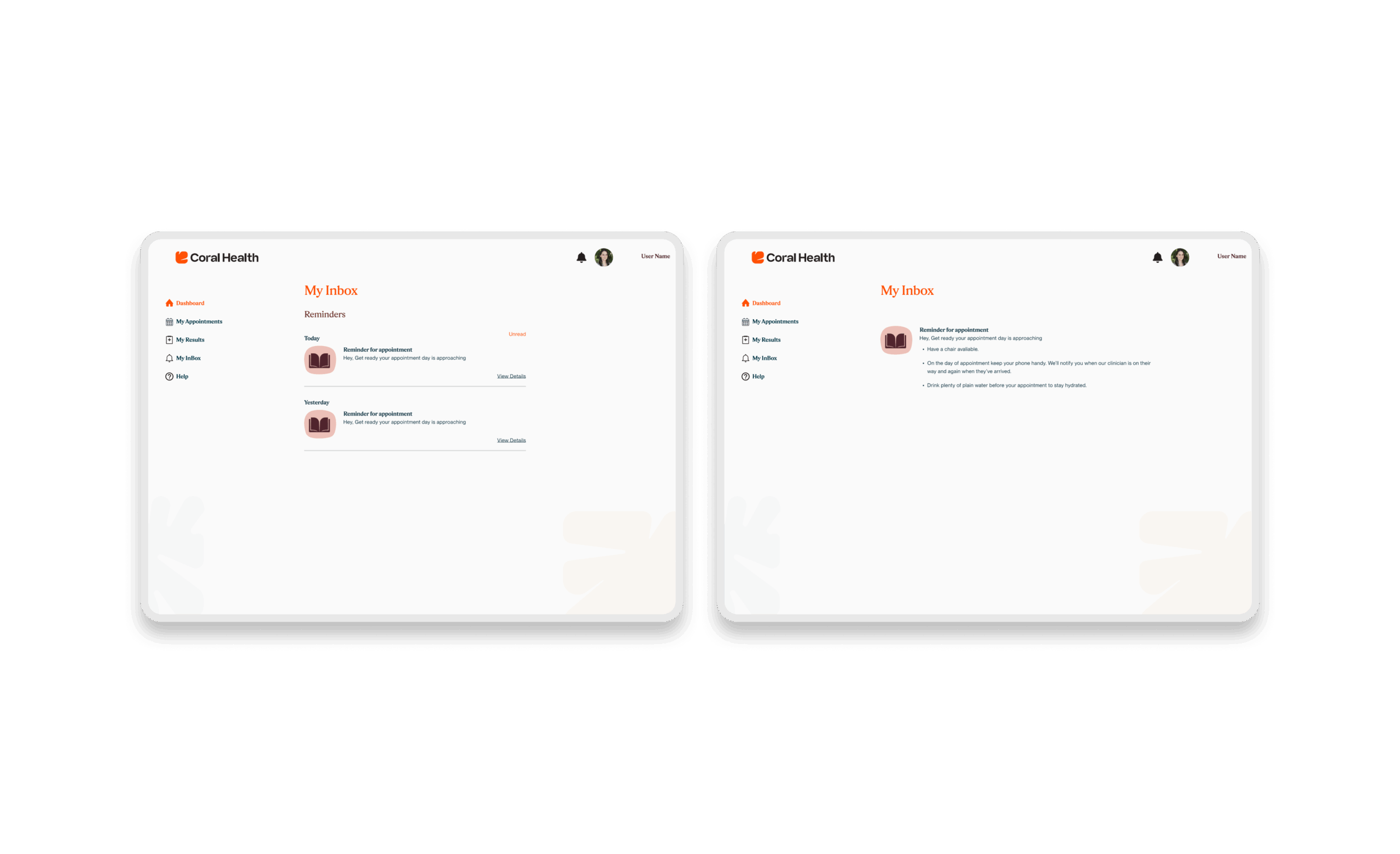
The experience design is built around eight interconnected modules that guide the user from uncertainty to action. These flows were designed to be non-linear, allowing users to enter and exit while always being re-oriented toward their next best health action.
Marketing & Brand Experience Designs
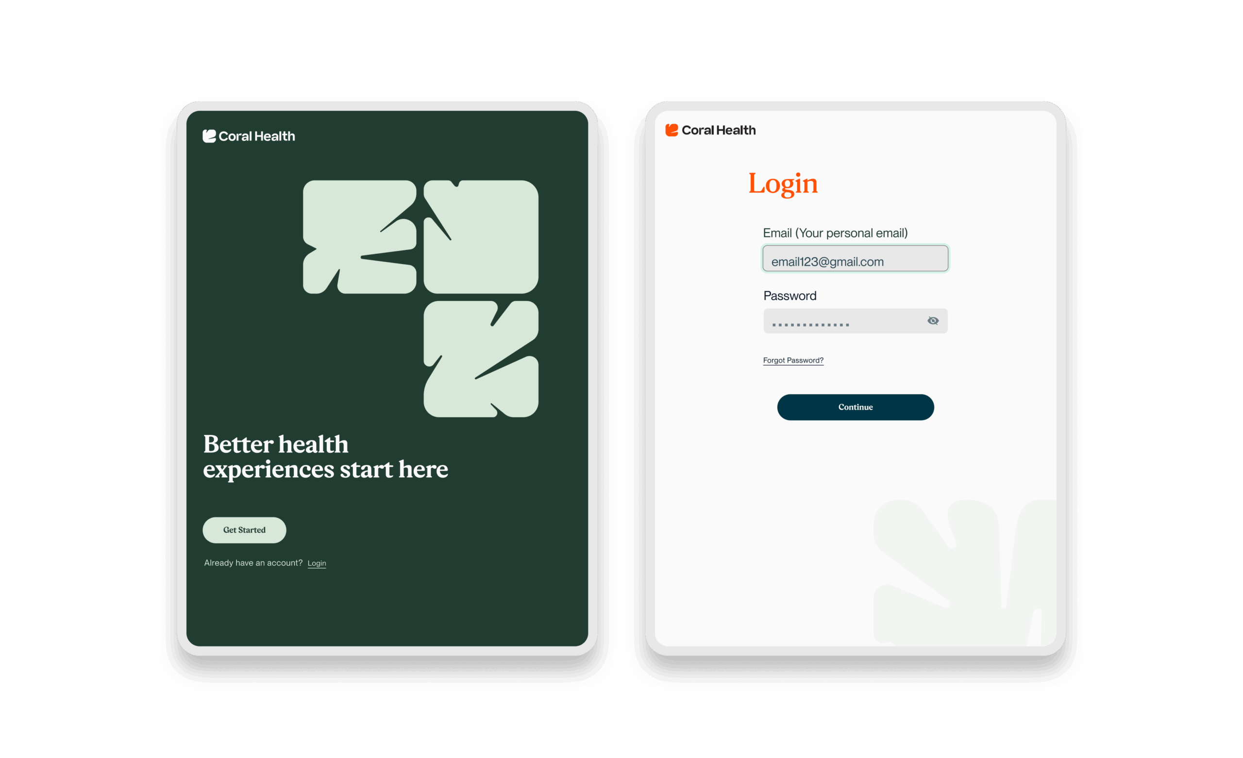
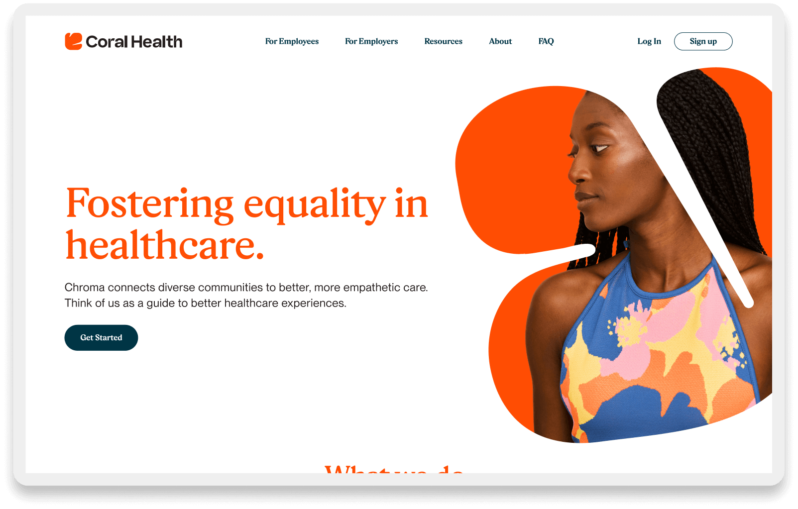
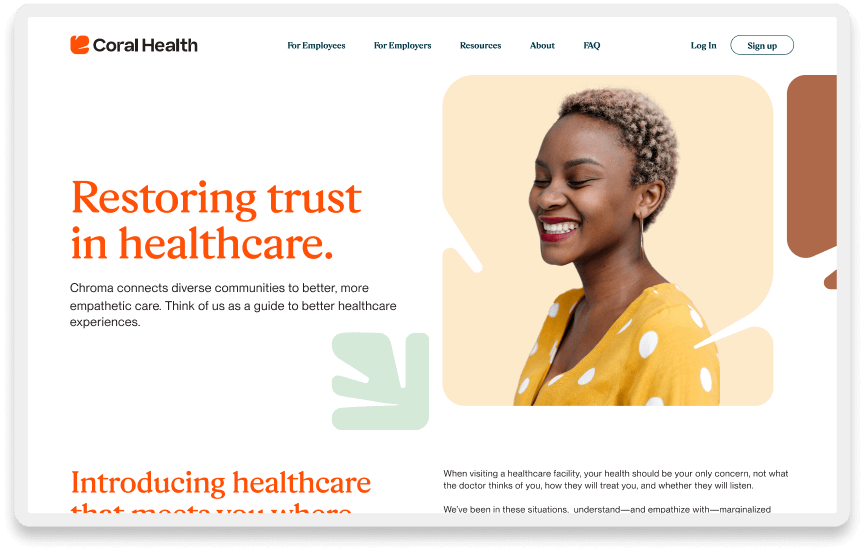
I also contributed to the design of the marketing site and brand identity. We knew that for underserved communities, the platform's "vibe" had to feel different from traditional corporate healthcare.
Supporting Designs Streams
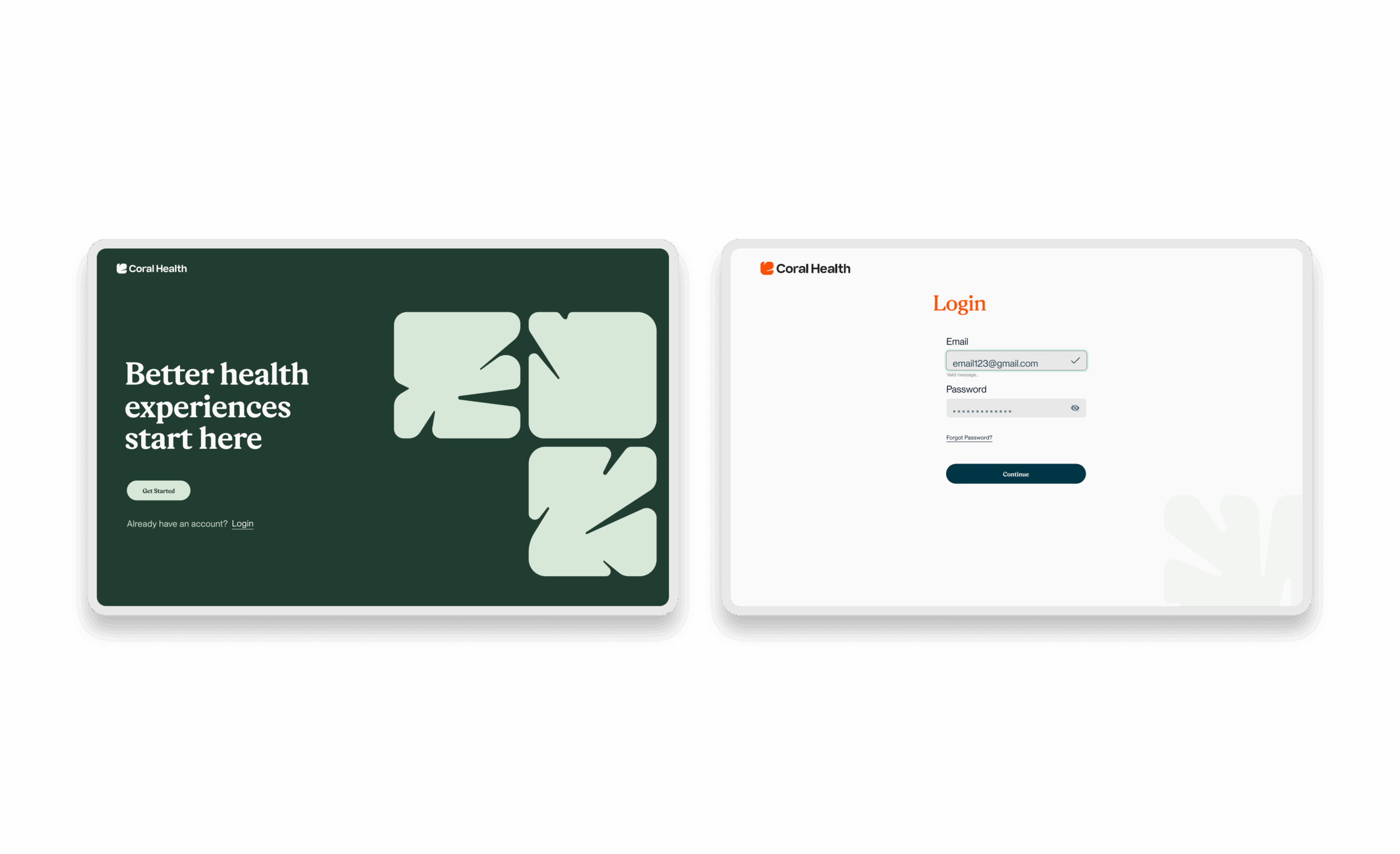
We developed a visual identity rooted in community warmth and representation, moving away from sterile medical blues to a more human, vibrant palette. The marketing site served a dual purpose: it validated the platform for potential users by showing people who looked like them, and it articulated the value of “culturally competent care” to employer partners. This top-of-funnel work was critical for adoption, as it framed the product as a place of safety and understanding, directly impacting our customer acquisition costs (CAC) and conversion rates.
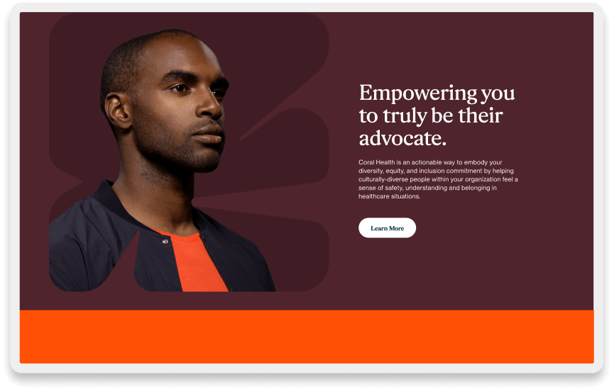

Empowering You to Truly be Their Advocate
Coral Health is an actionable way to support your organization's diversity, equity, and inclusion commitment by helping culturally diverse people within your organization feel a sense of safety, understanding, and belonging in healthcare situations.
Research Outputs (Tools, Methods & Frameworks)
Here are some artifacts during the design-led research process where I produce a library of strategic artifacts. These weren’t just deliverables; they were the tools we used to align the organization around the reality of the patient experience and our success metrics.
Provider Match Retention
Users found and stuck with culturally competent providers
Screening Follow-Through
Increase in users completing recommended screenings
Funding Influenced
Experience strategy helped secure funding, demonstrating engagement and scalability
Reflections & Impact
Coral Health was founded on the vision of advancing healthcare equity, led by pioneers Dr. Fatima Cody Stanford and Dr. Chris T. Pernell. To translate their expertise into a scalable digital experience, we realized that traditional metrics like “clicks” were insufficient. We needed to measure behavioral change. By anchoring our decisions in the UX KPI Impact assessment, we connected specific design decisions directly to the organization’s business objectives.
We tracked success across three connected layers. First, we monitored UX Quality (specifically “Error Rate” and “Content Clarity”) to ensure we eliminated the friction that leads to permanent abandonment in kit ordering. Second, we measured Experience Performance using “Time to Relevant Match” and “Support Demand Reduction” to demonstrate that the design was reducing anxiety and doing the heavy lifting. Finally, we mapped these signals to Business Impact, specifically Screening Completion (Revenue Realization) and Appointment Attendance (Cost Efficiency). This rigor shifted the internal conversation from “features” to “outcomes.” The results, including a 75% retention rate over a 6-month pilot period, show users actively engaging the platform for ongoing screening recommendations. By demonstrating that equity-centered design lowers cost-to-serve and directly influences the “Time to Purchase”, we positioned Coral Health as a leader in the space, securing the capital and partnerships necessary to scale this impact to more lives.
Next Steps
- Expand screening pathways by leveraging the validated modular framework to address other high-disparity conditions, such as diabetes and hypertension.
- Deepen matching models by incorporating richer variables, such as communication style, into the algorithm to drive down further “Time to Relevant Match.”
- Enhance navigation to automate “human-in-the-loop” reminders to sustain gains in at-home drop-off rates.
- Build dashboards for employer analytics that visualize the ROI of equity for B2B partners, proving the “Business Objective” connection directly to their bottom line.